
AZB & Partners
Creating the brand language for a ‘ruler’ brand
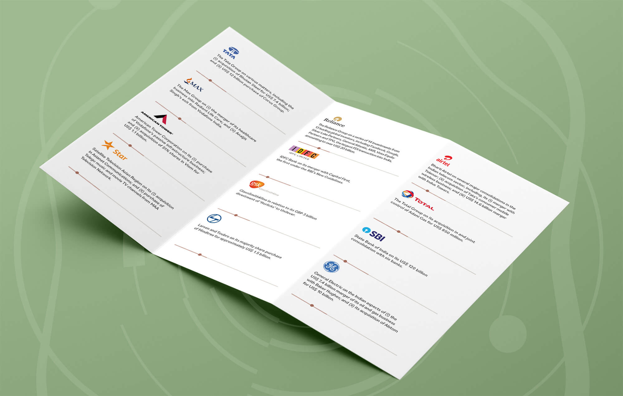
AZB & Partners is a reliable, practical and full–service advice to clients, across all sectors.
While it’s important to focus on WHAT the firm does, the differentiation lies in the HOW and WHY.
A defined brand personality will manifest in a unique aesthetic and visual style for AZB & Partners.
Paying homage to the legacy of the organisation
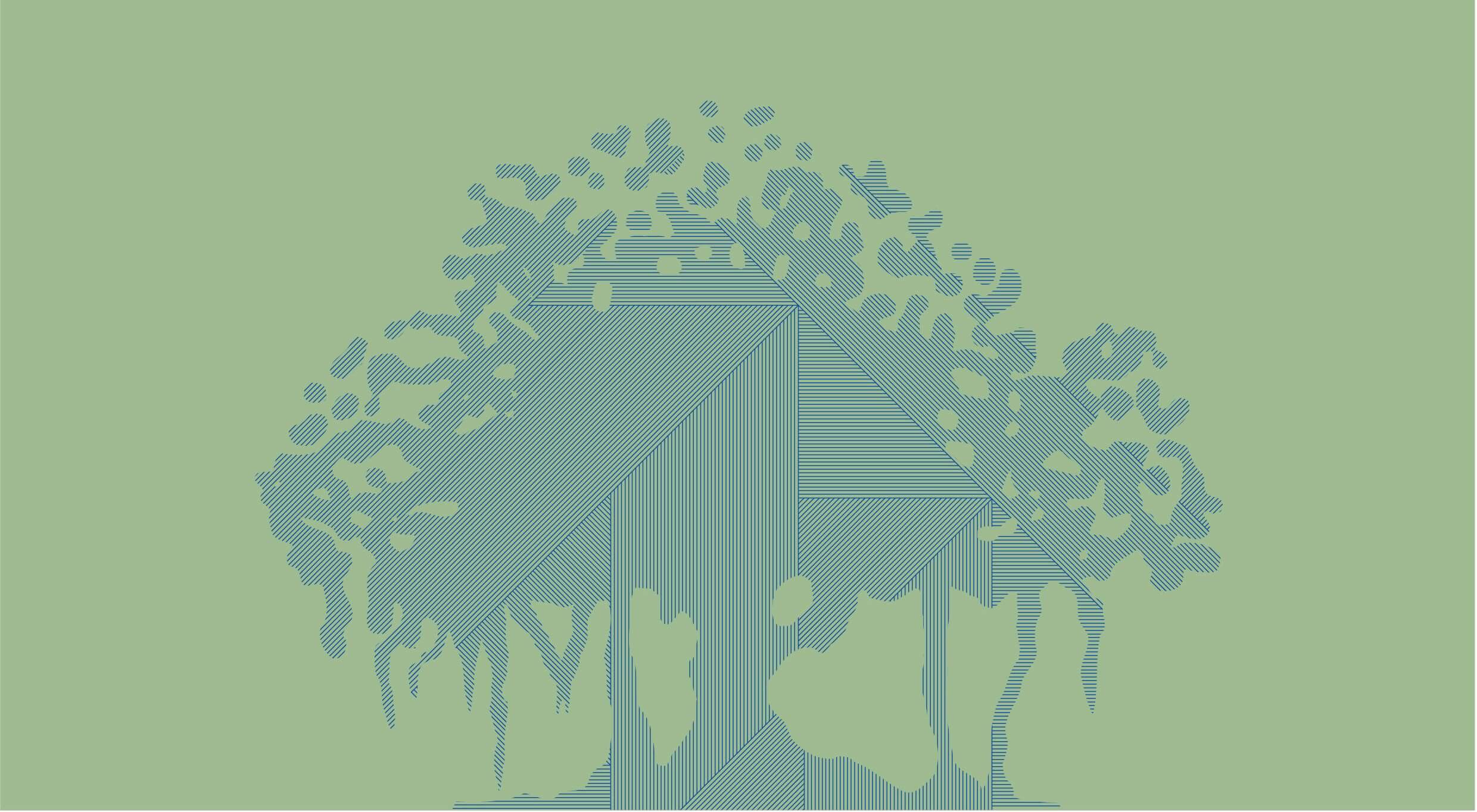
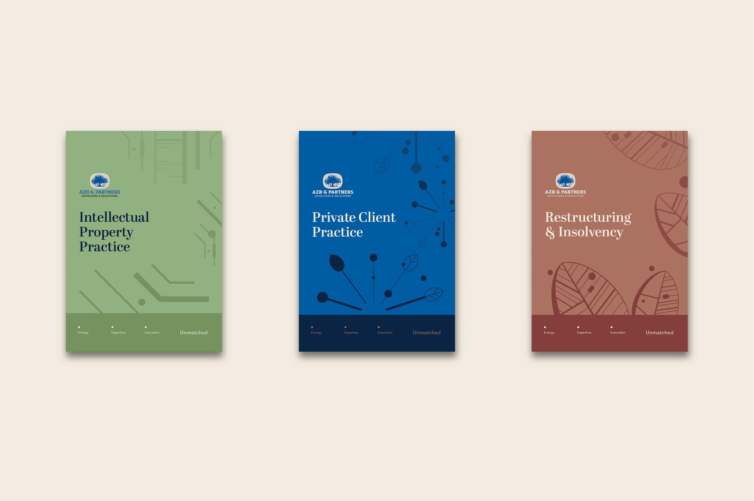
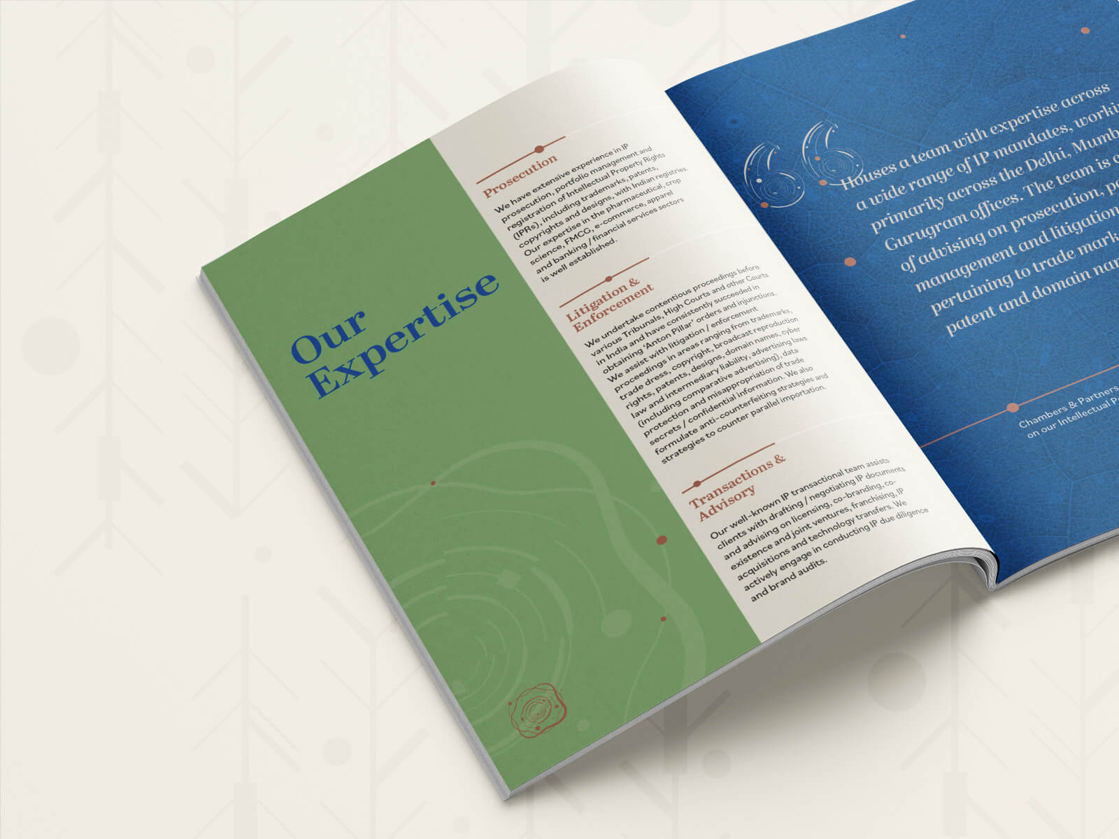
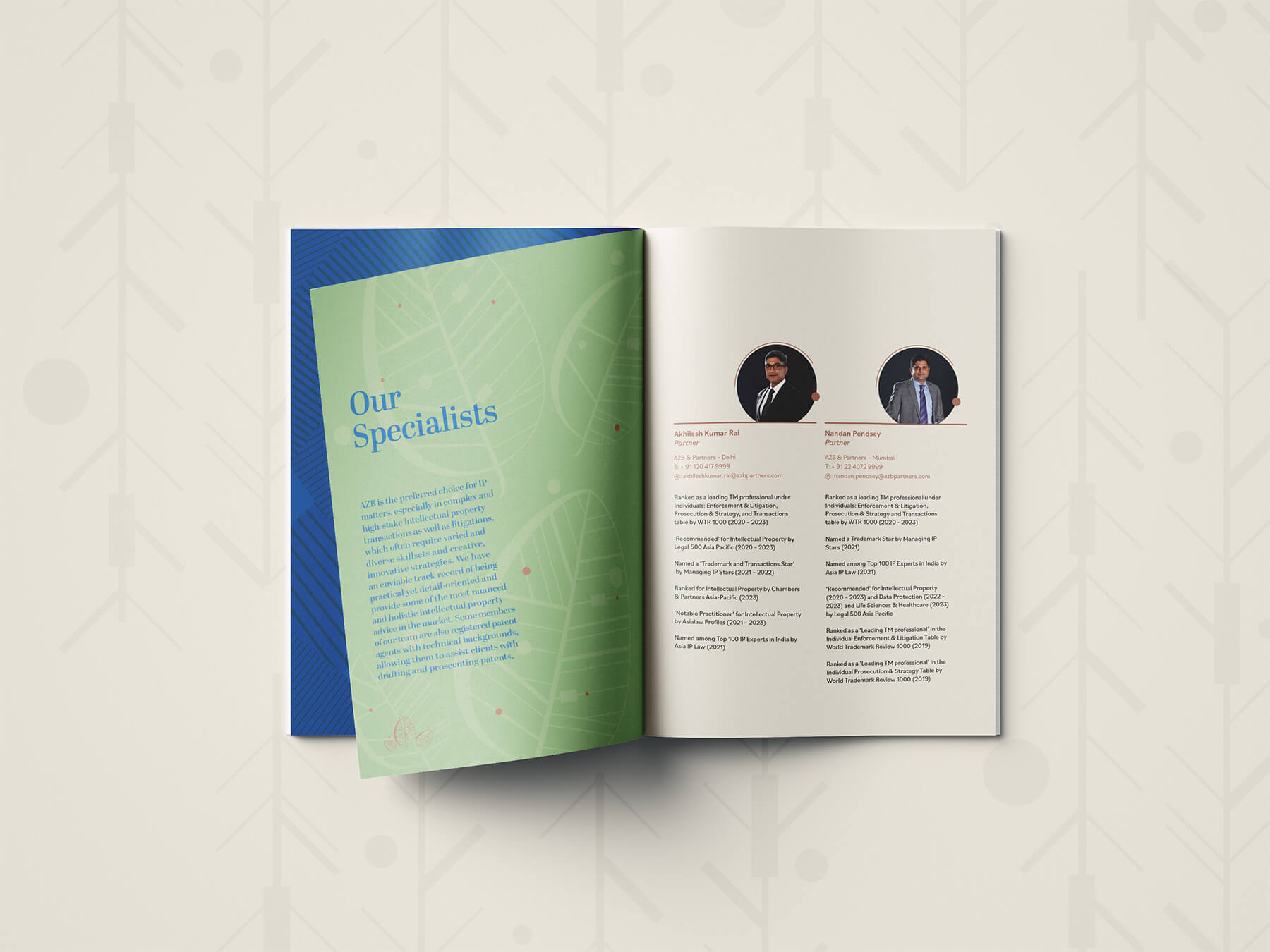
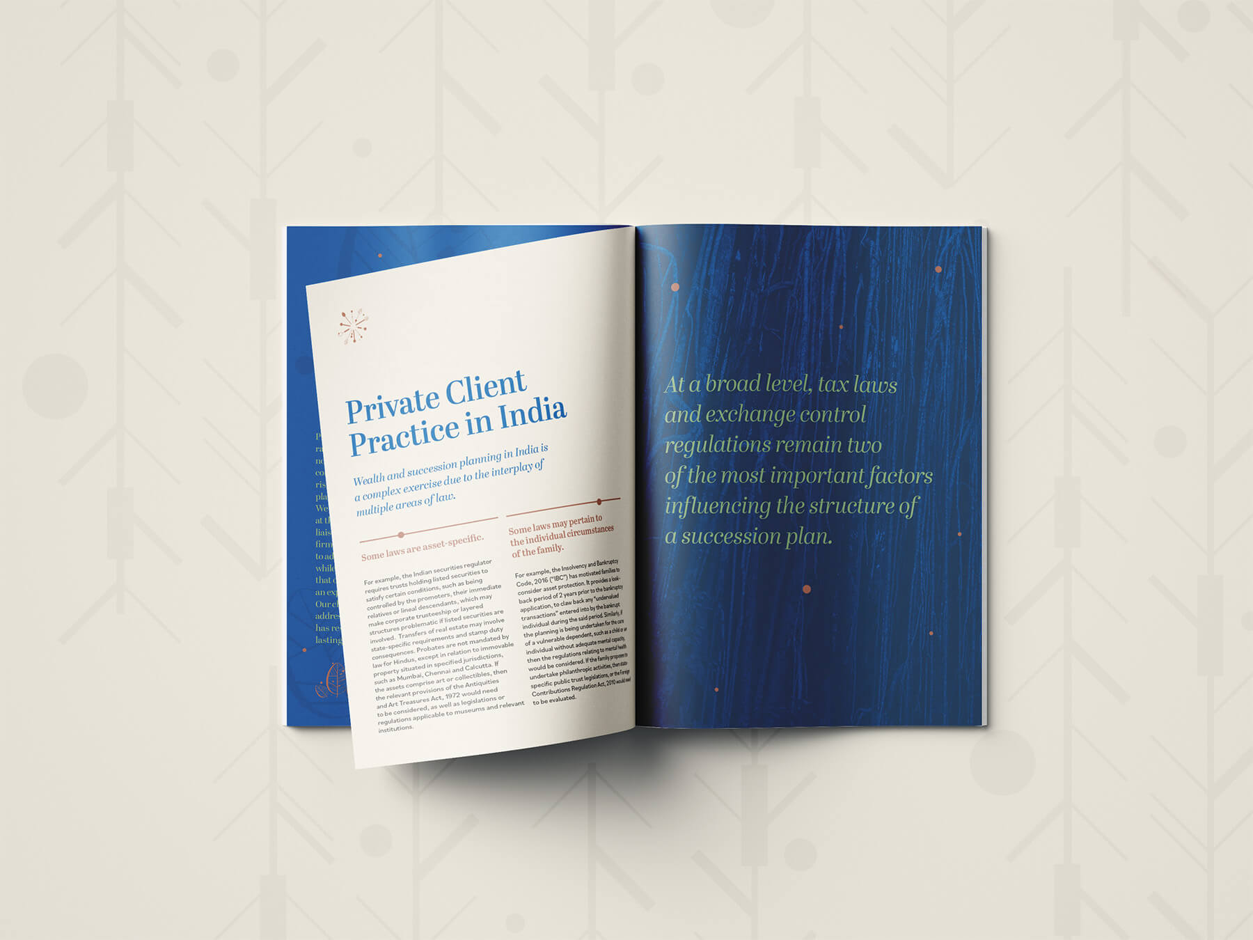
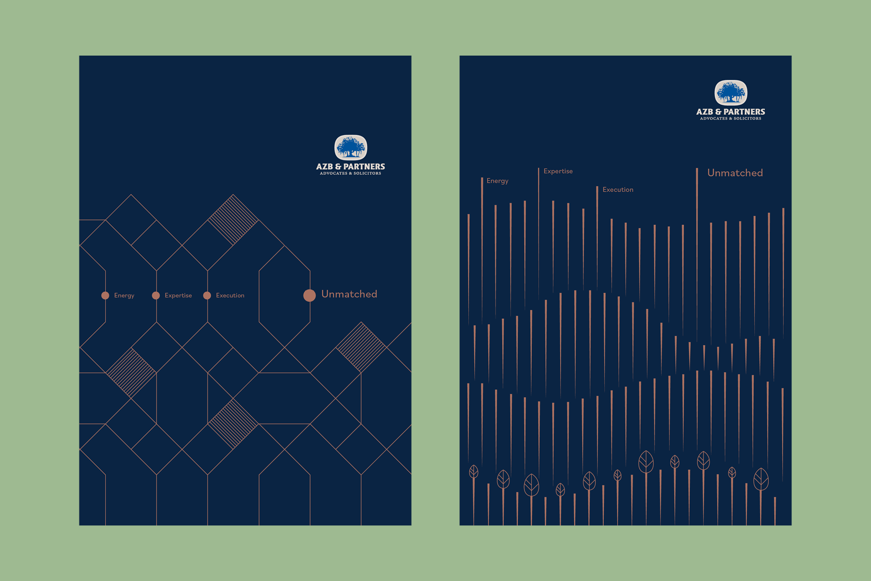
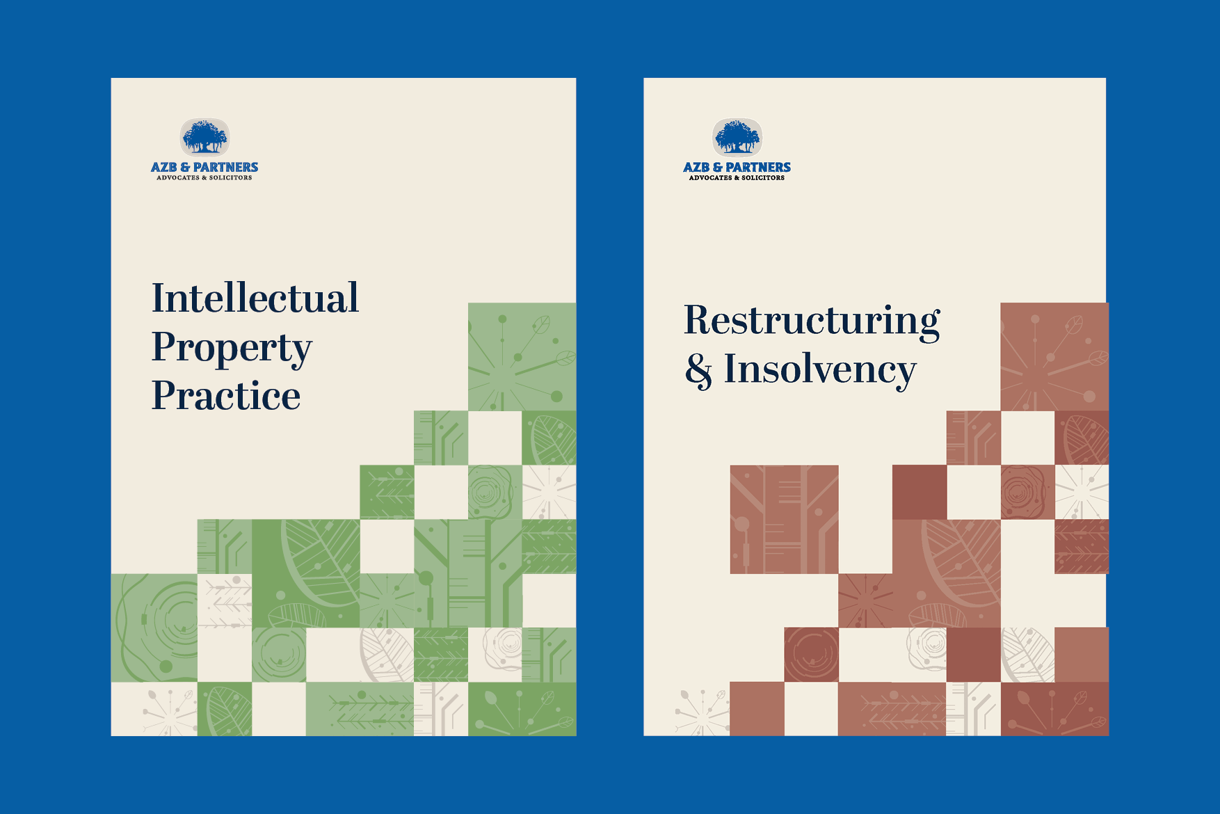
The AZB & Partners logo is a banyan tree – rooted, standing on firm ground, majestic and steeped in knowledge.We created a visual language for AZB & Partners keeping the banyan tree at the heart of it.
We studied the significance and meaning of the banyan tree, and why it was so integral to the organisation. We then recognised the various parts that create this majestic tree – the roots, leaves, rings, canopy and trunk – and used that symbolism to build our visual language.
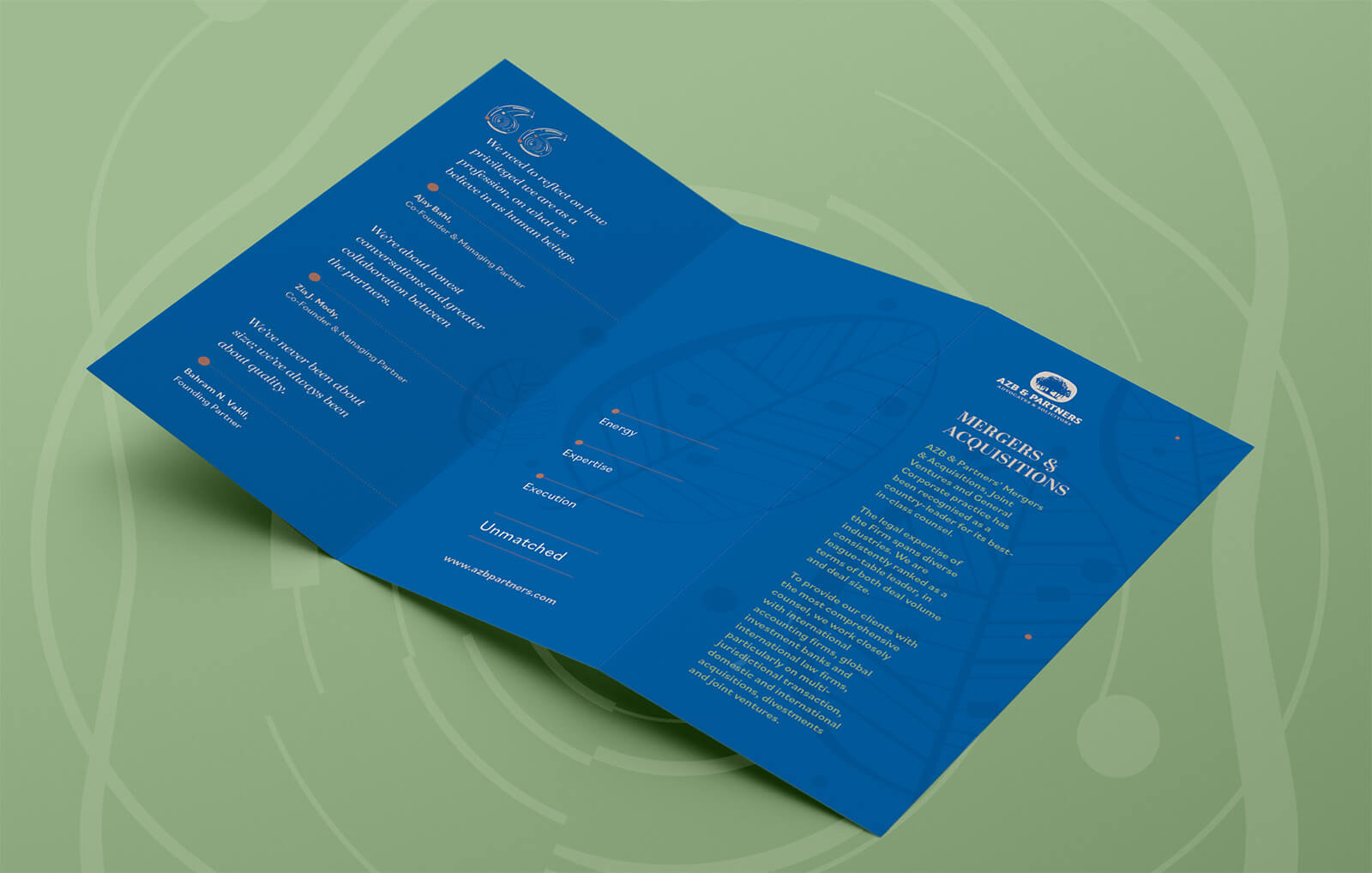
 We’ve never been about size; we’ve always been about quality.
–
Bahram N. Vakil,
Founding Partner
We’re about honest conversations and greater collaboration between the partners. We are mandated to share knowledge, and are less proprietorial about our territory. What benefits one, must benefit all.
–
Zia J. Mody
Co-Founder & Managing Partner
We need to reflect on how privileged we are as a profession, on what we believe in as human beings. The fact is, someone else is doing the hard work.
–
Ajay Bahl
Co-Founder & Managing Partner
Tone of Voice
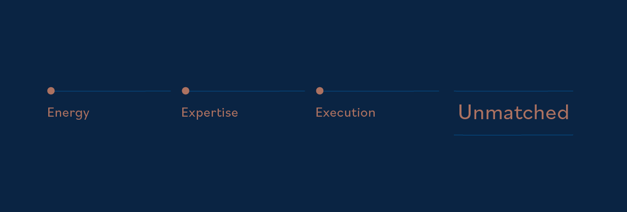
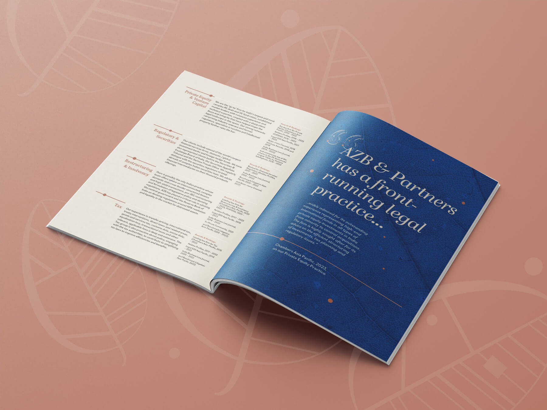
As a ruler brand, AZB & Partners speak with confidence and authority. The language uses words and quotations that convey minimalism, control, erudition, and modernity.
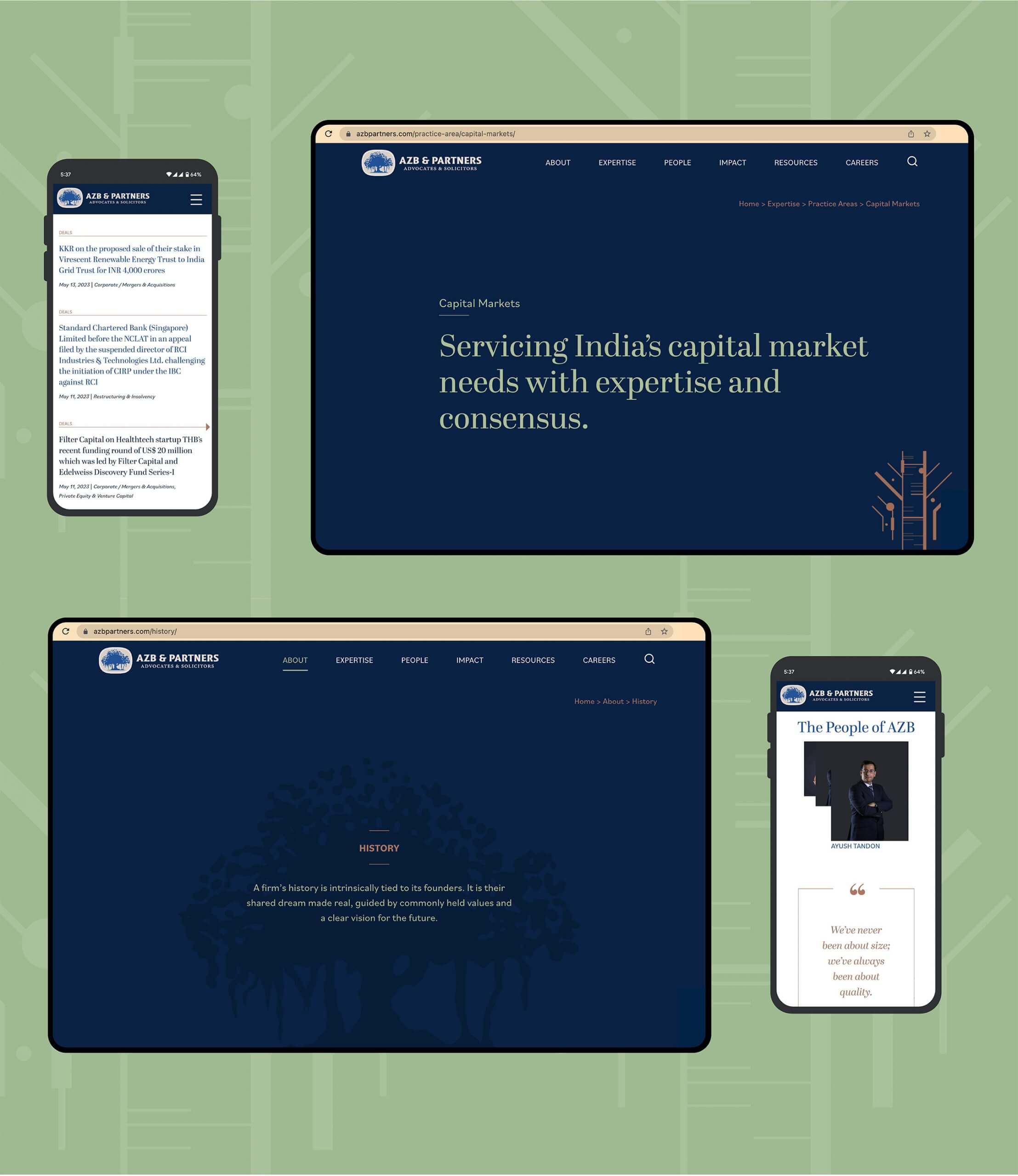
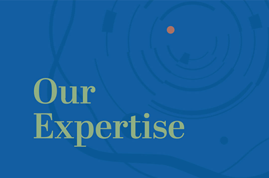
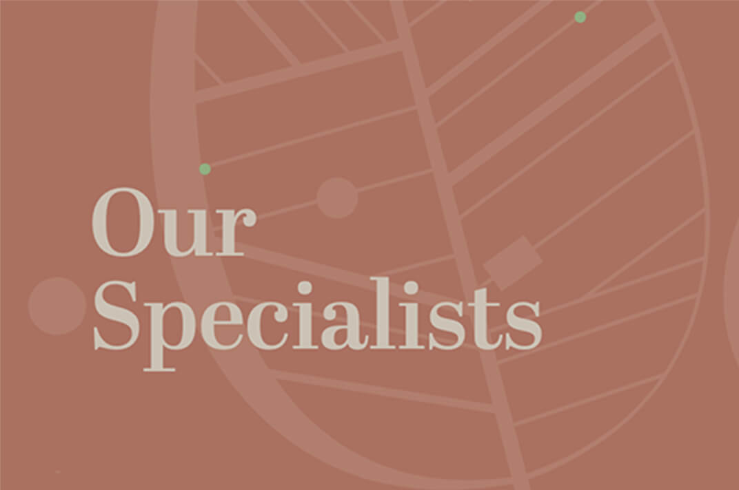
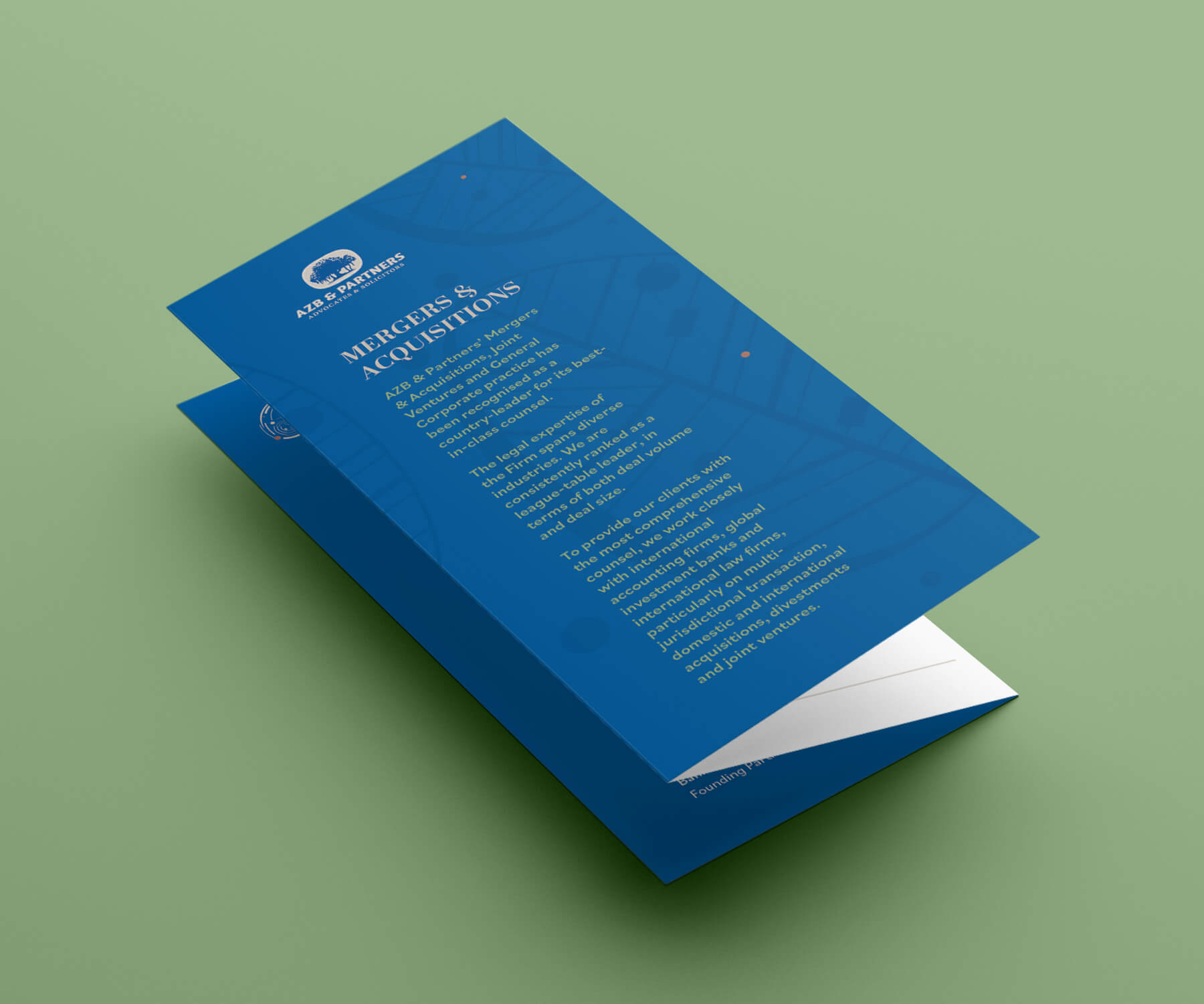
Creating a Visual Design System
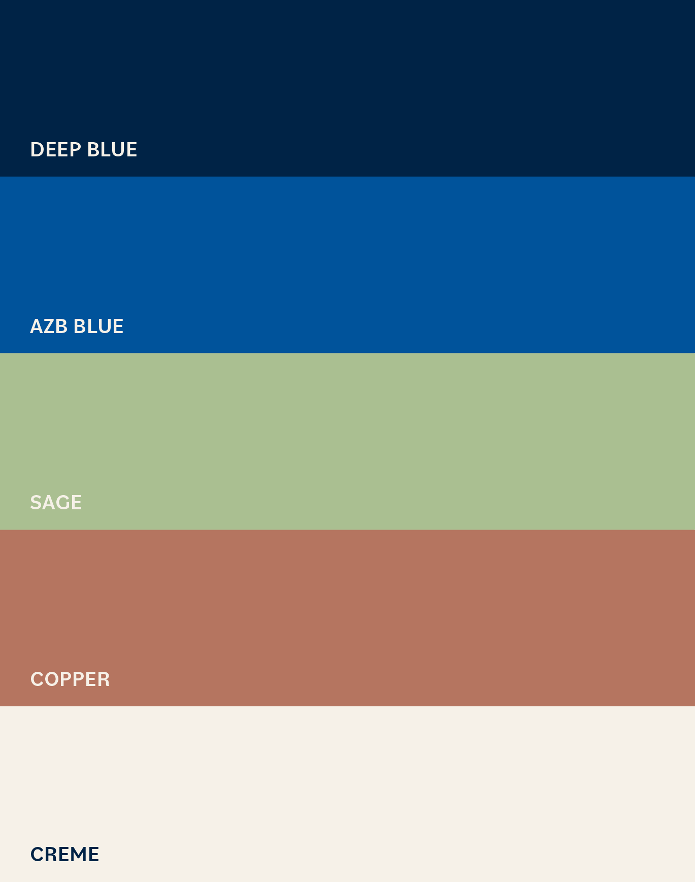
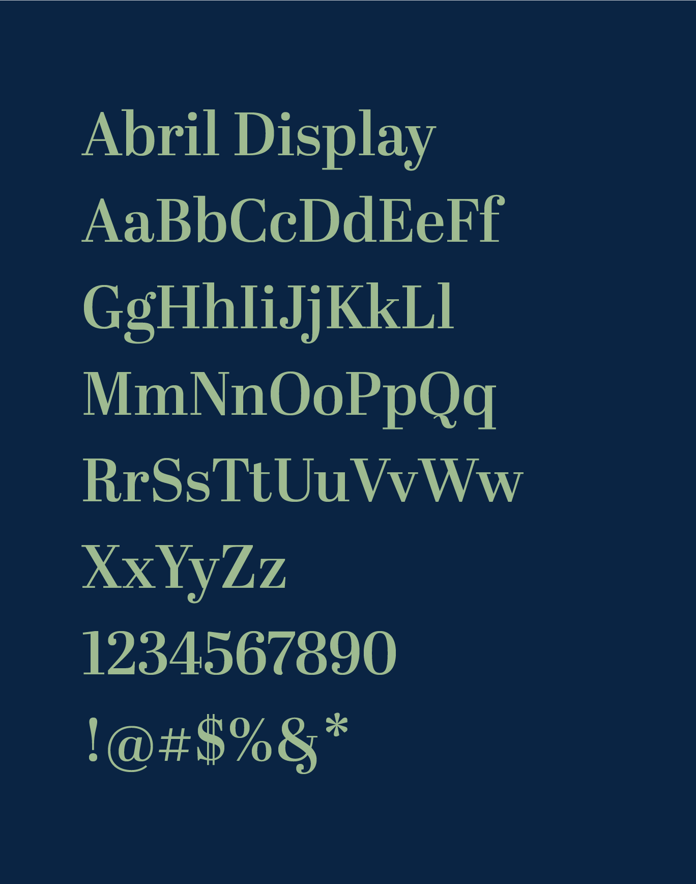
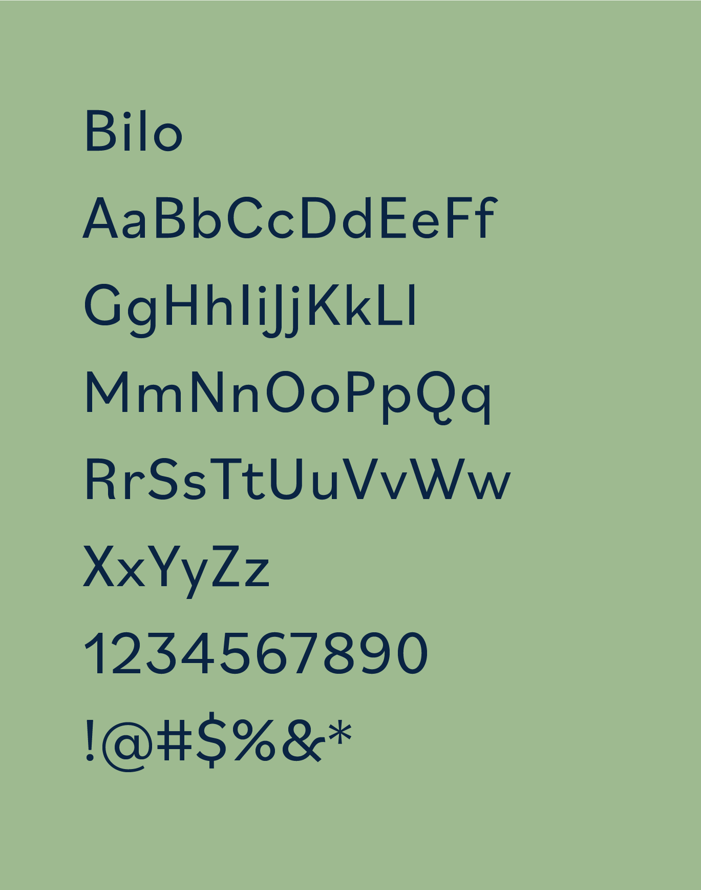
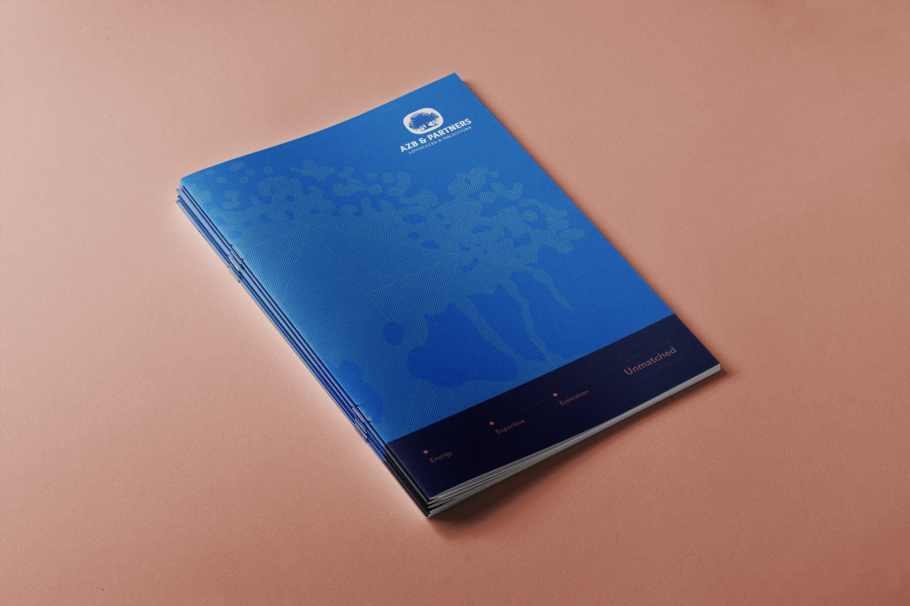
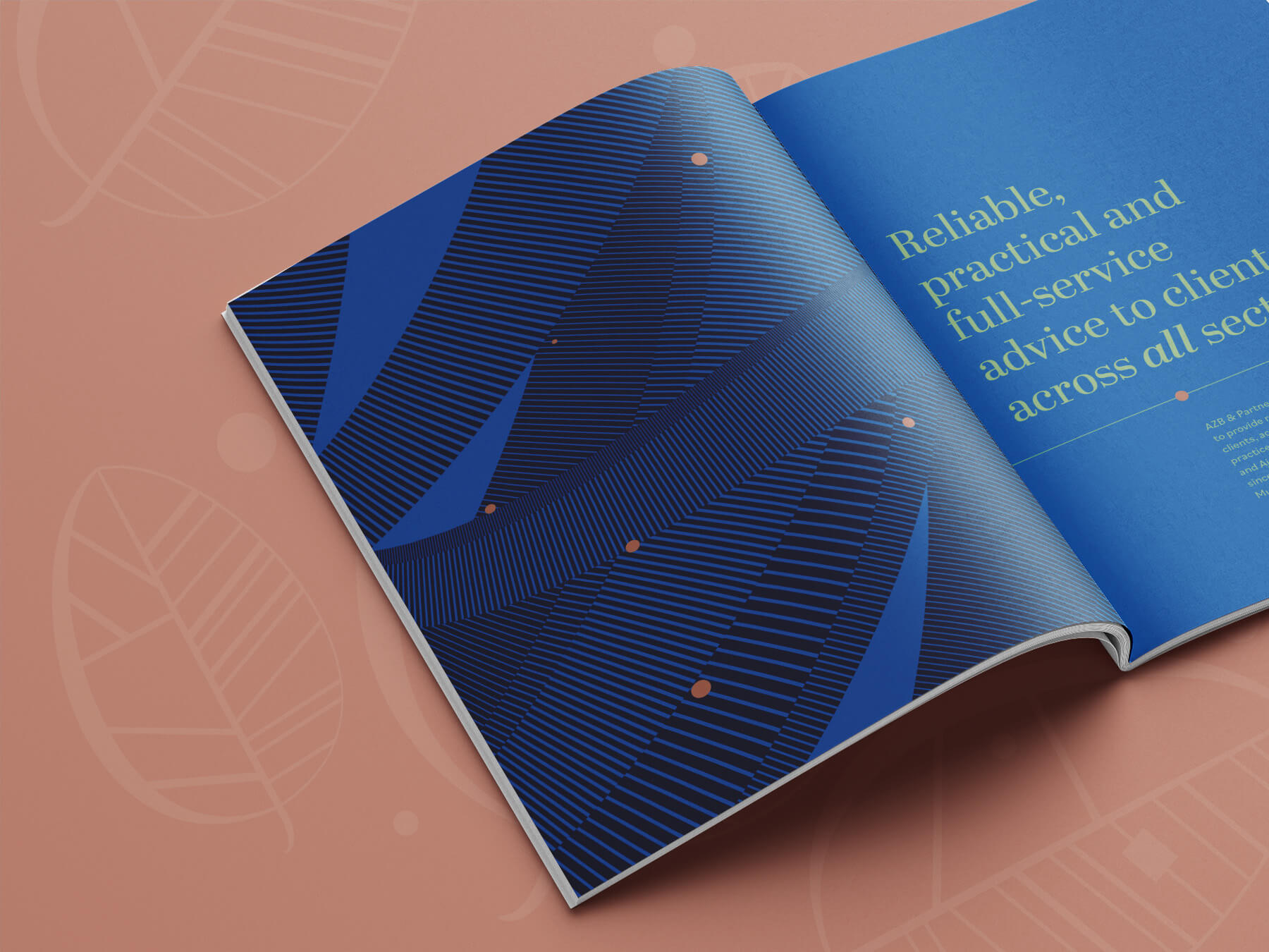
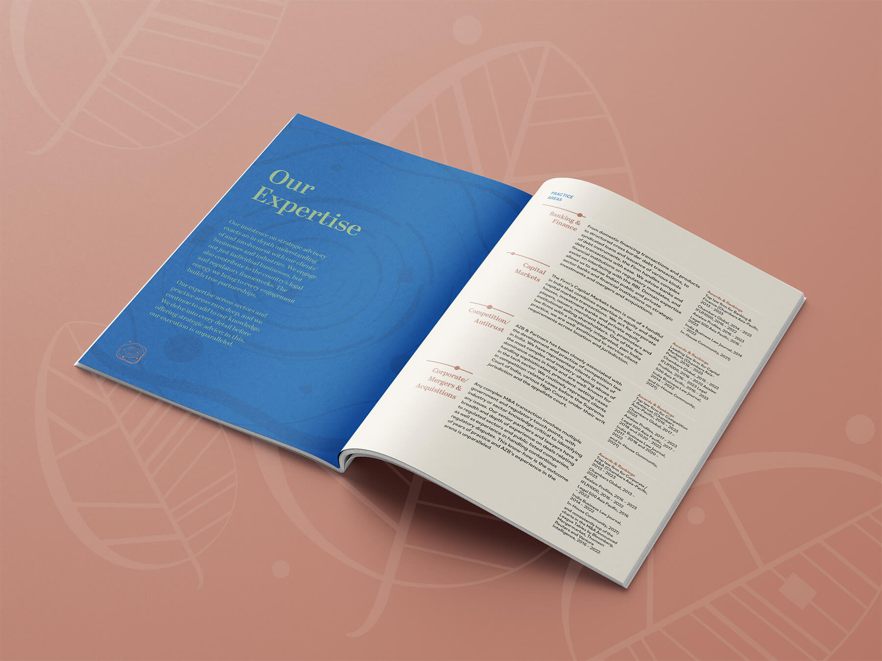
We designed all the communication material for AZB & Partners – firm brochure, handbooks for the Practice Areas, inlets that support the handbooks, social media templates and a folder that carries all of this within.The design language is intricate, embellished with copper highlights and smart serif typefaces. Solid colours and over-sized quotes create visual pauses between the detailed pages of content.


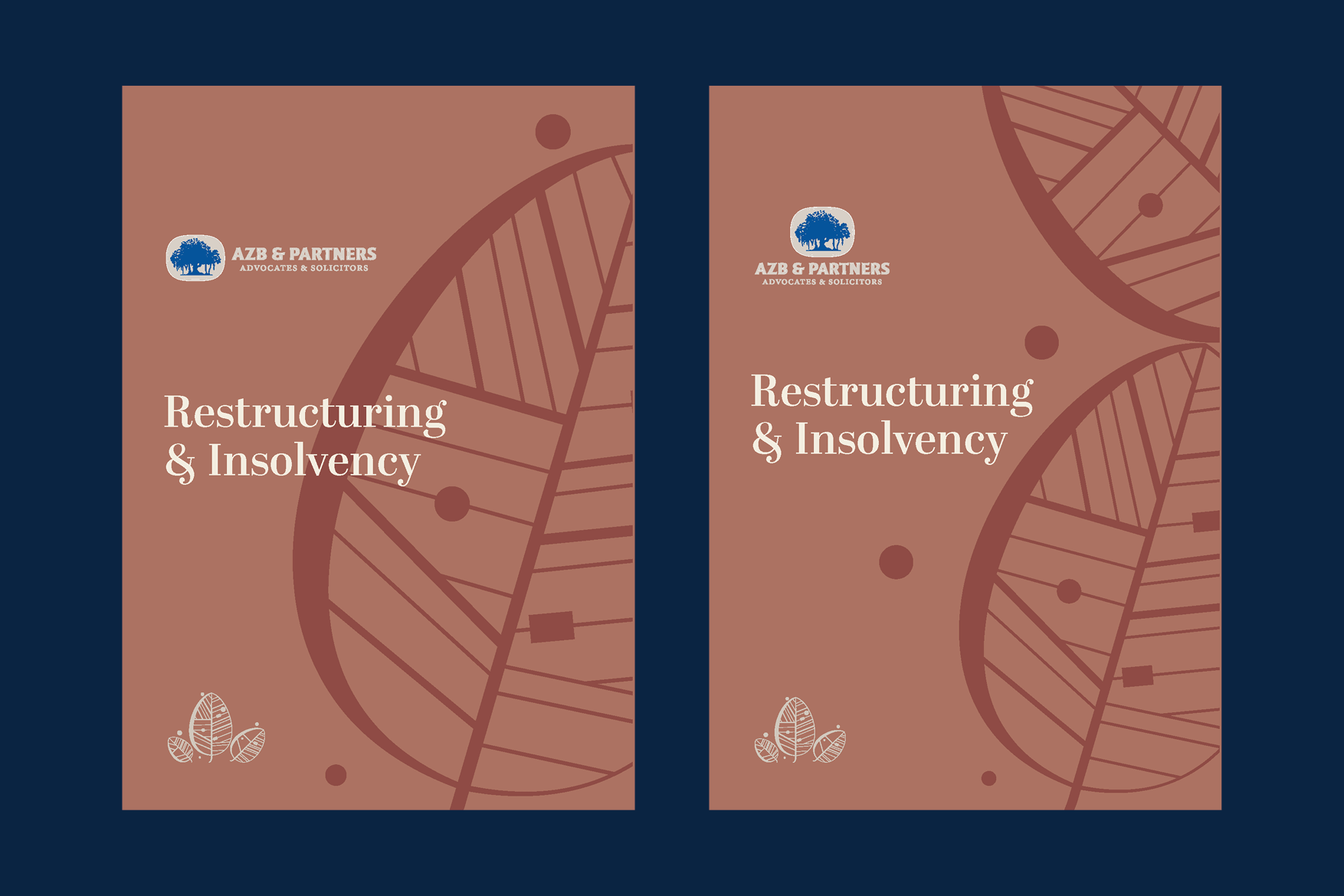
An iterative process
We explored several variations for the covers, before we arrived at the final design. Below is a collection of some explorations that never made it across the finish line.
Team
Design Director
- Seema Seth
Content
- Sukhita Aiyar
Design
- Solaiappan R
- Rashmi Dinesh
Web Development
- Pankaj Sharma
Client Team
- Eshan Sharma
- Aarti Pandit