
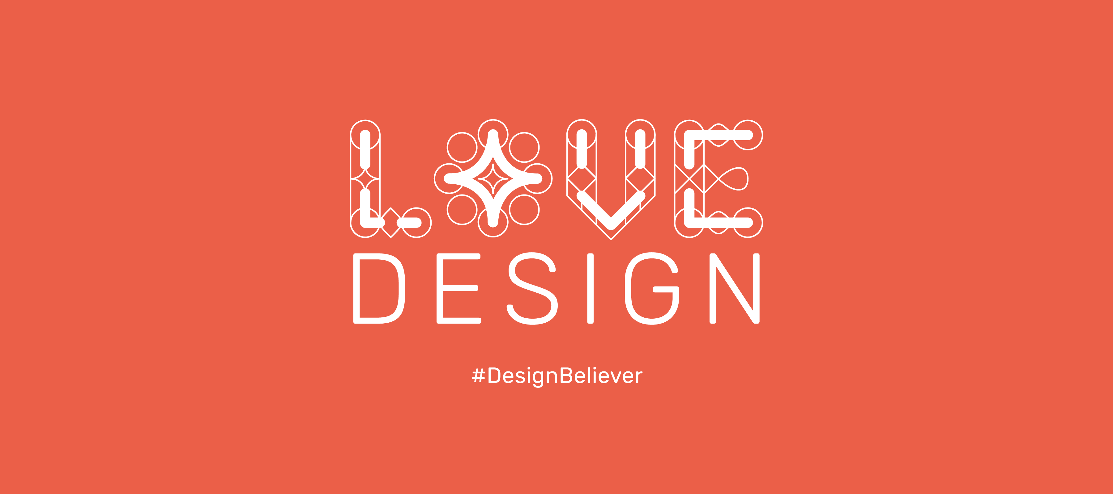
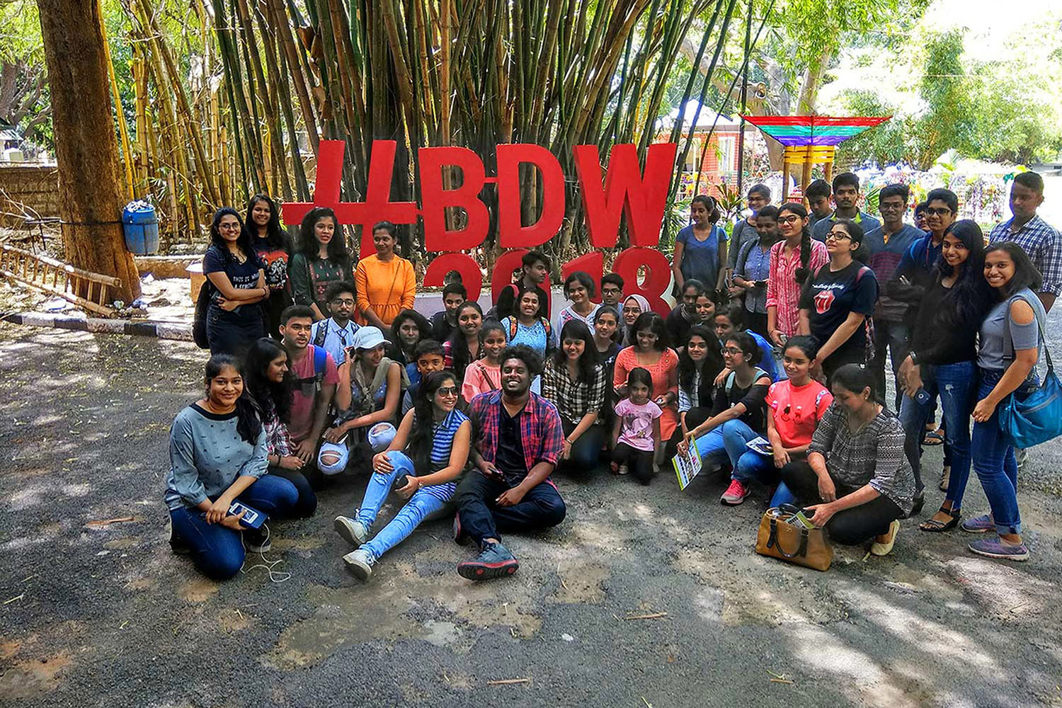
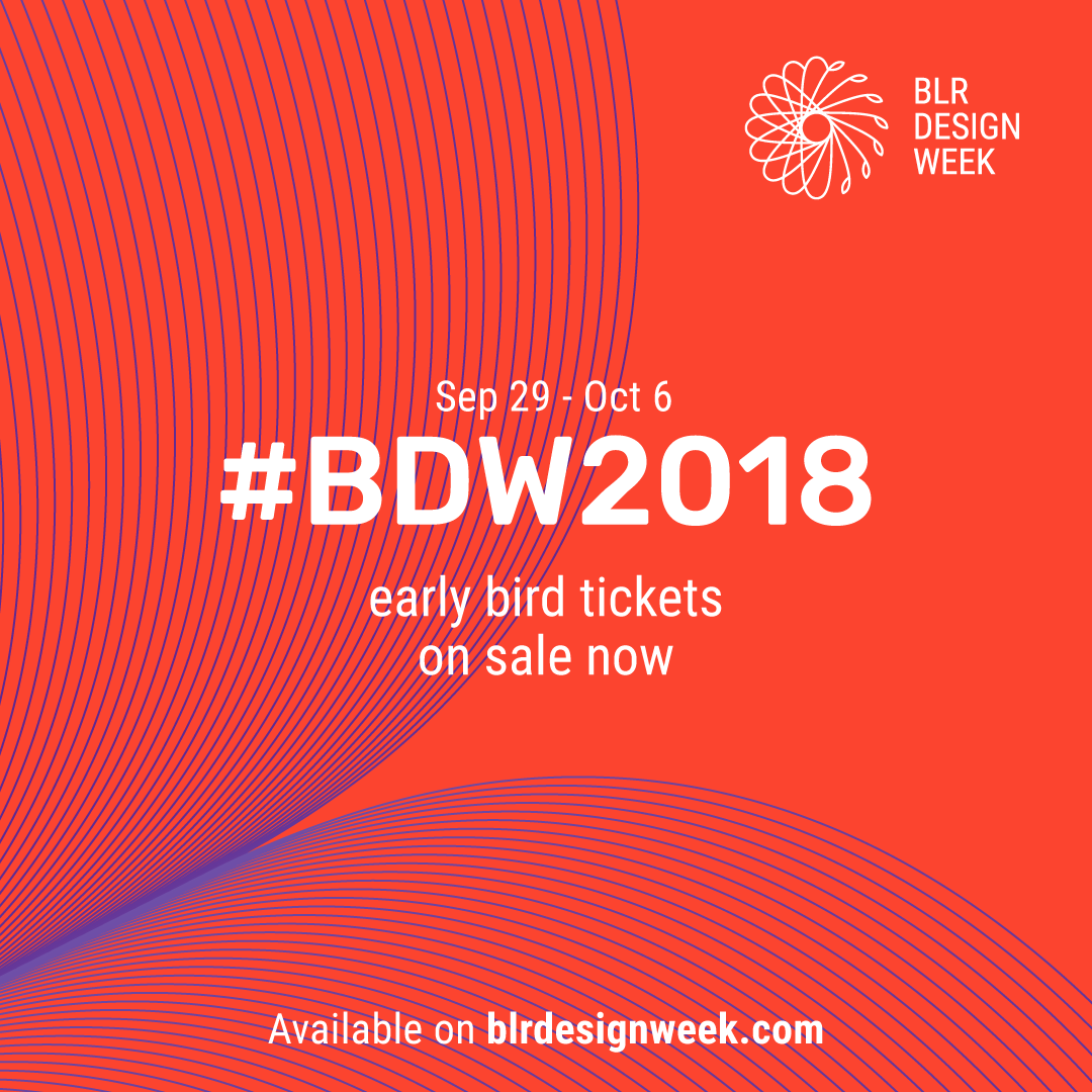
Bengaluru Design Week 2018
Breathing life into India’s very first design week
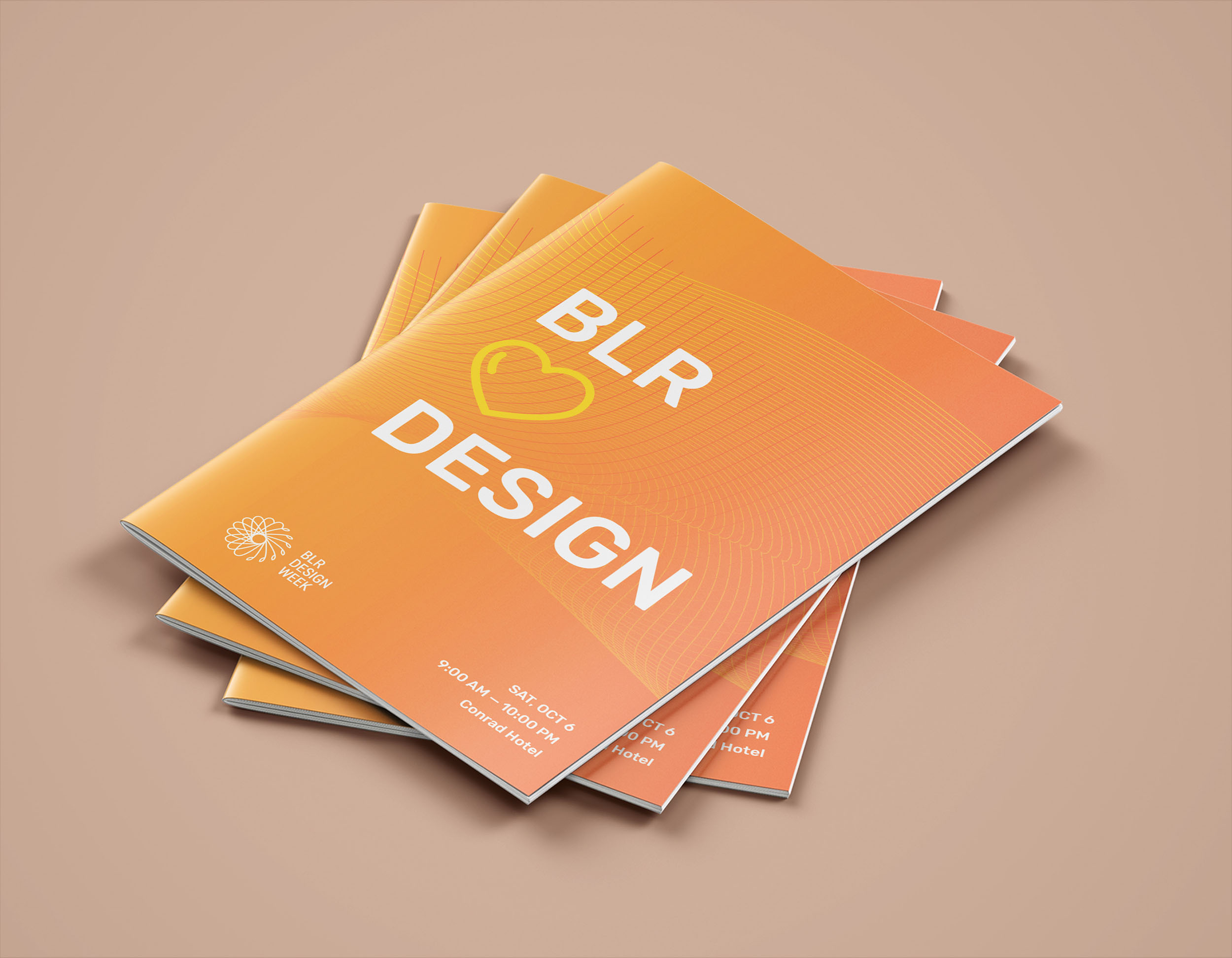
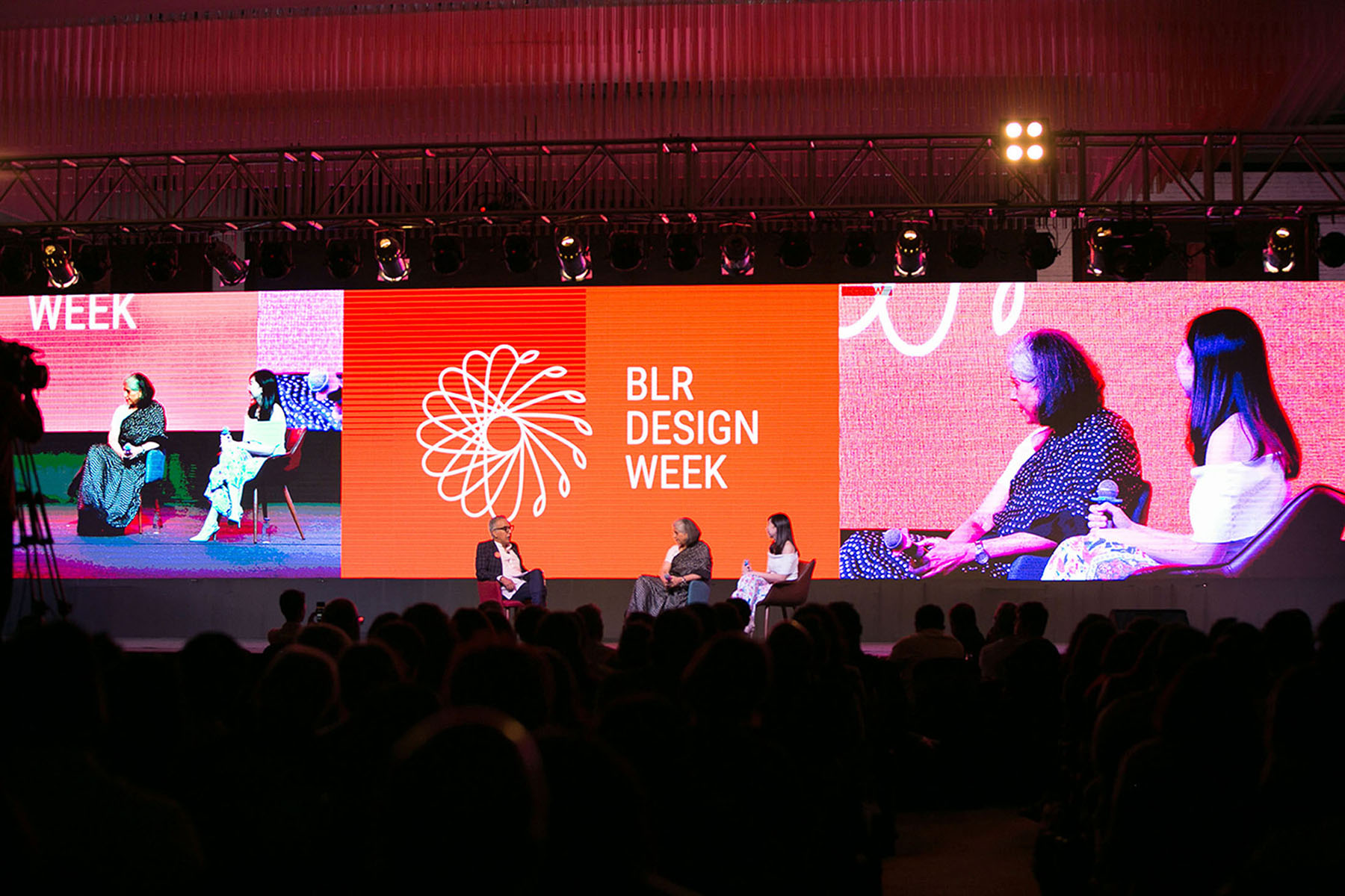
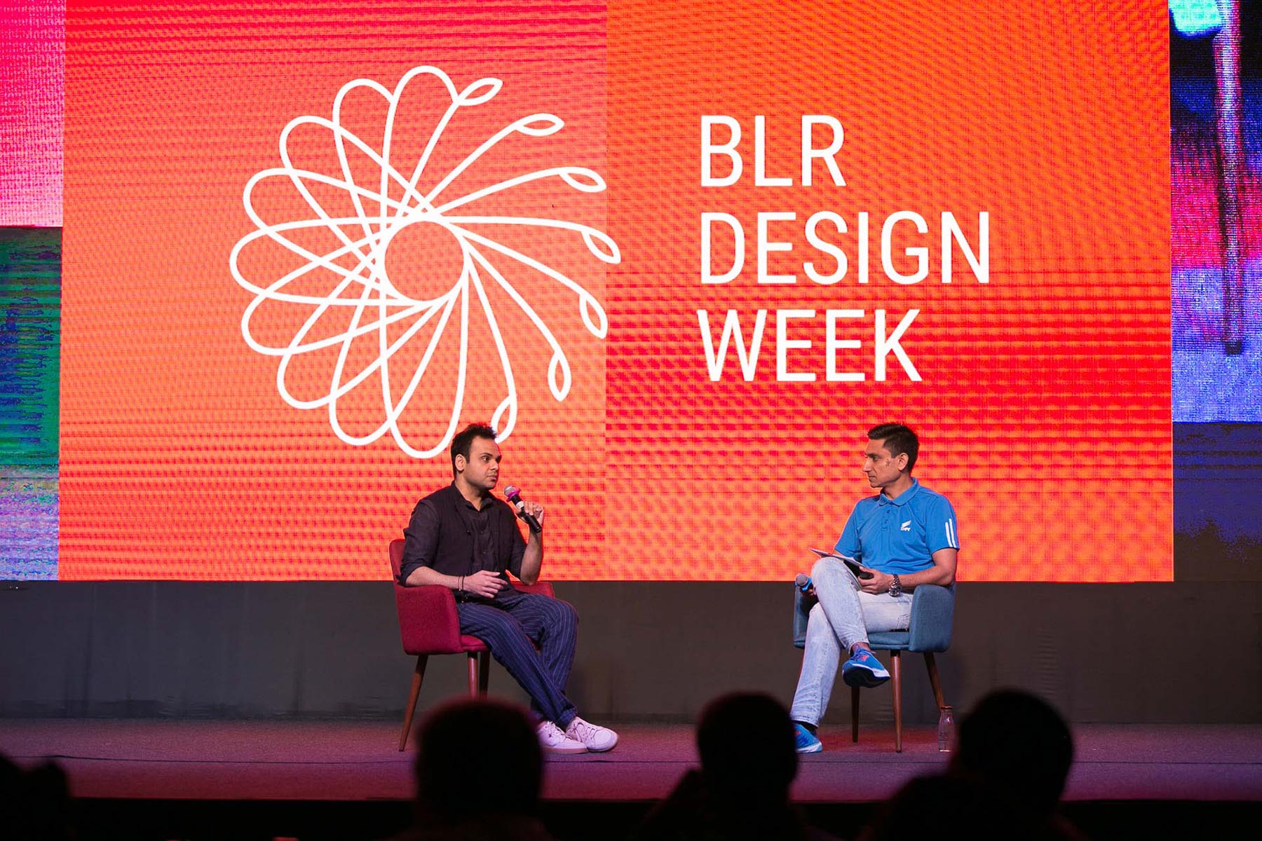
A celebration of design, inspired by the city of Bengaluru. We worked closely with BDW2018, to design the brand, experience and communication design.
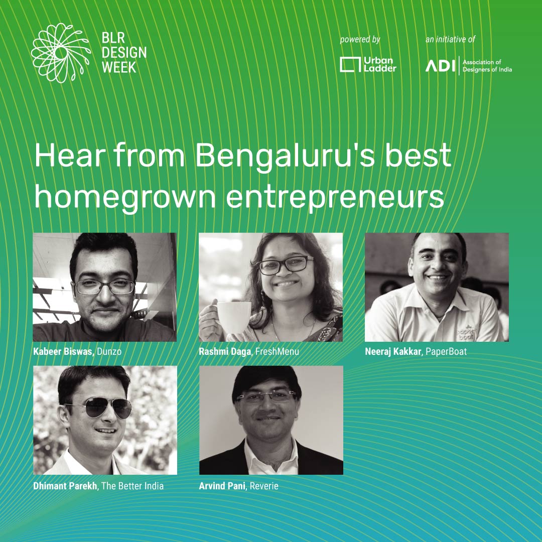
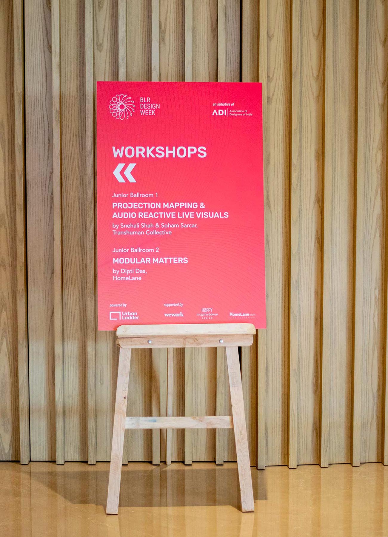
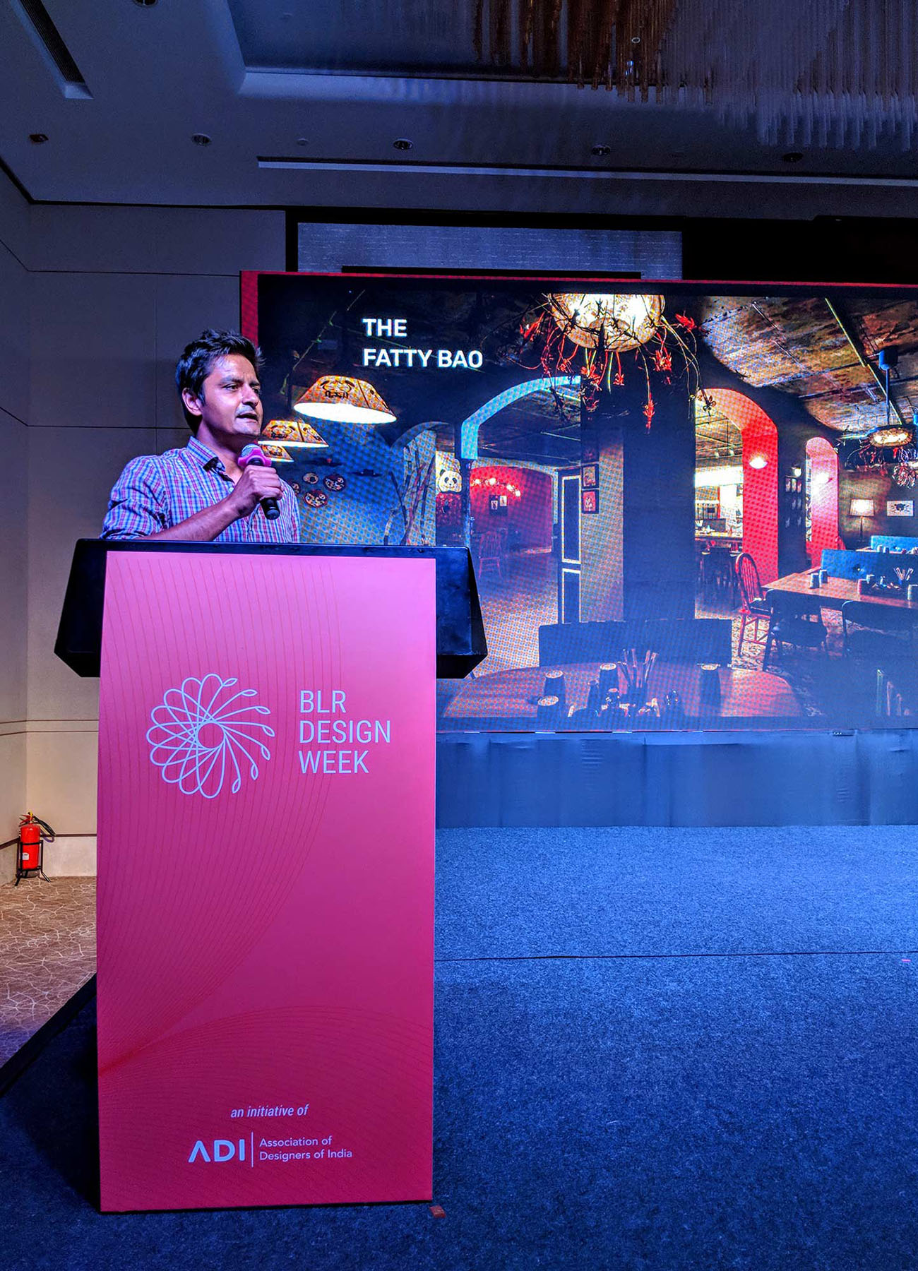
The events ranged from a Sante (marketplace), Showcase, Collage (co-hosted events), Film Festival and a Conference.
An identity inspired by balance
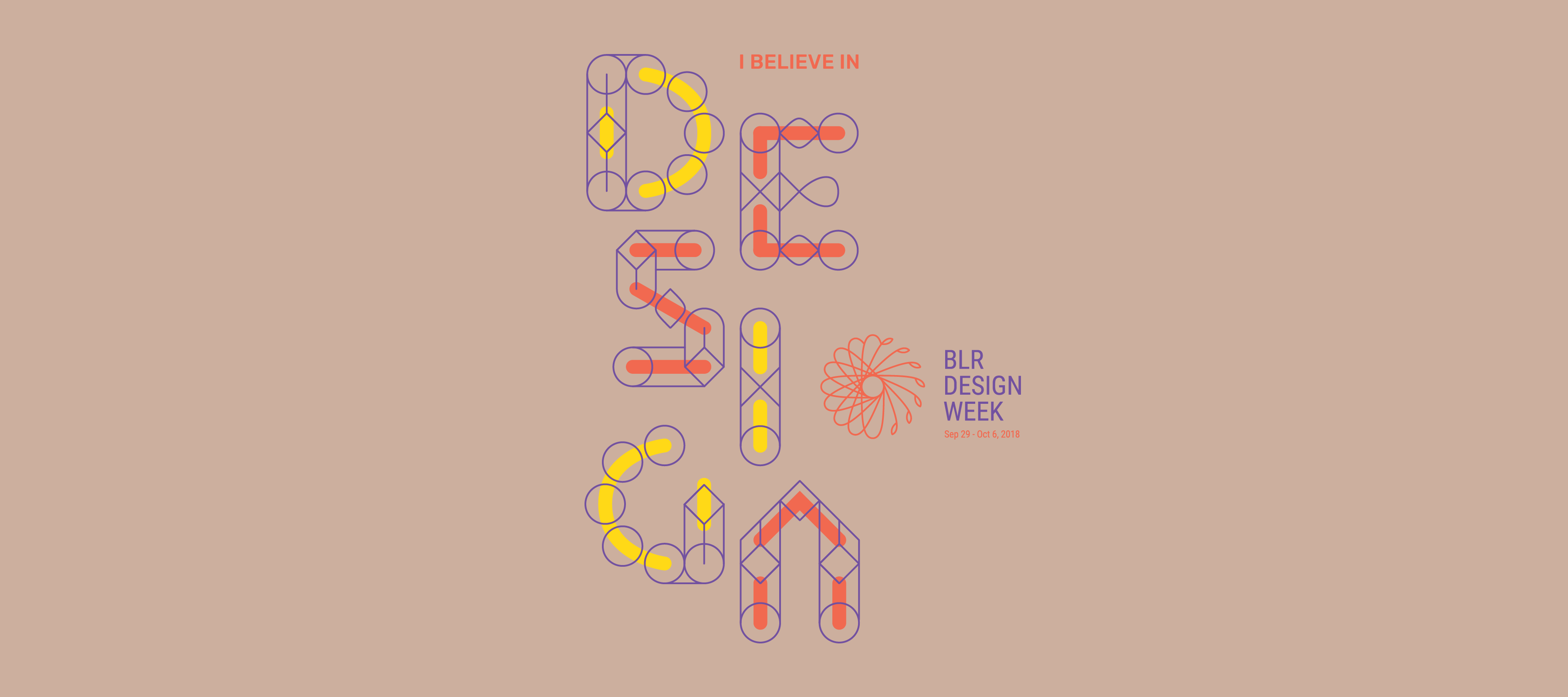
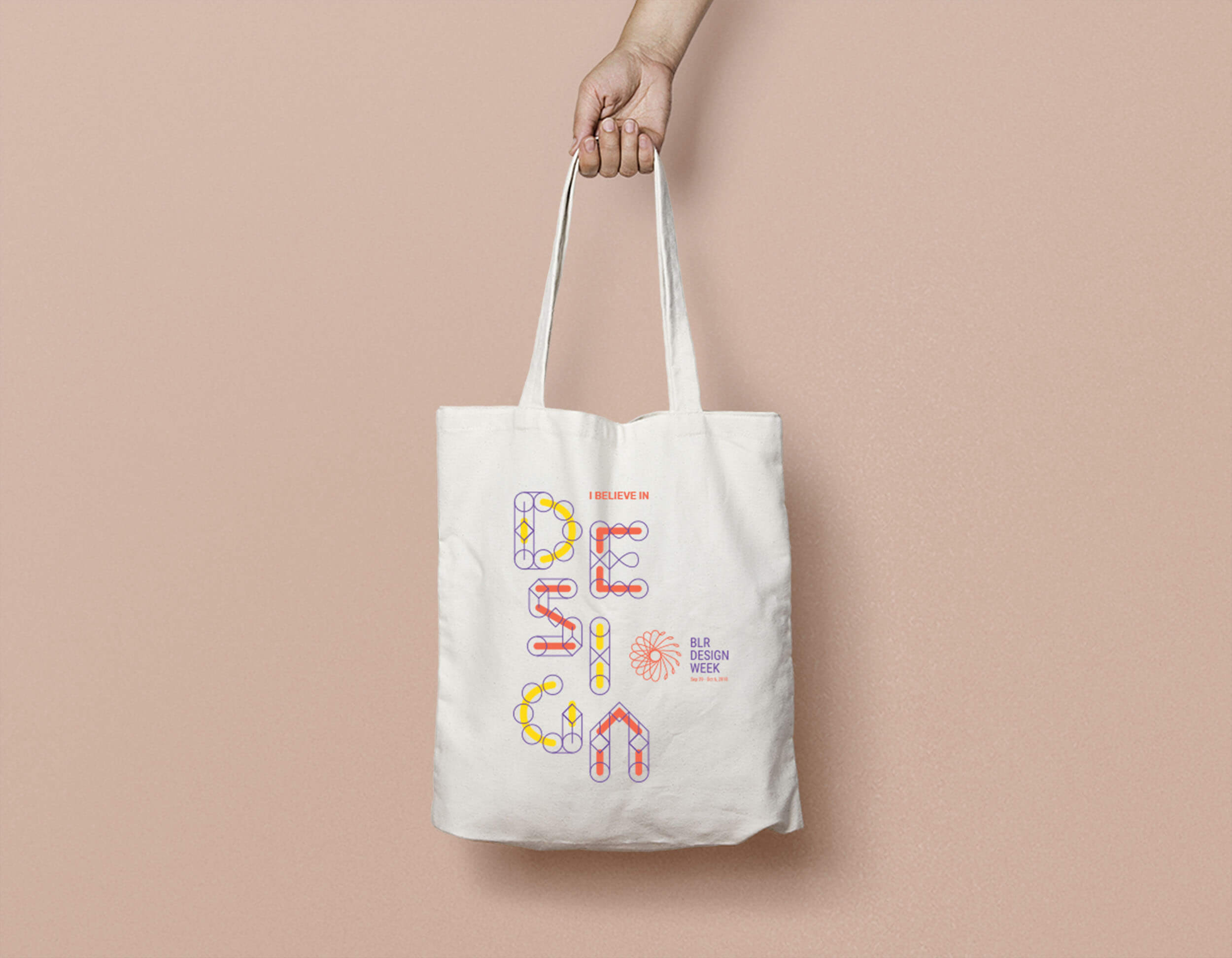
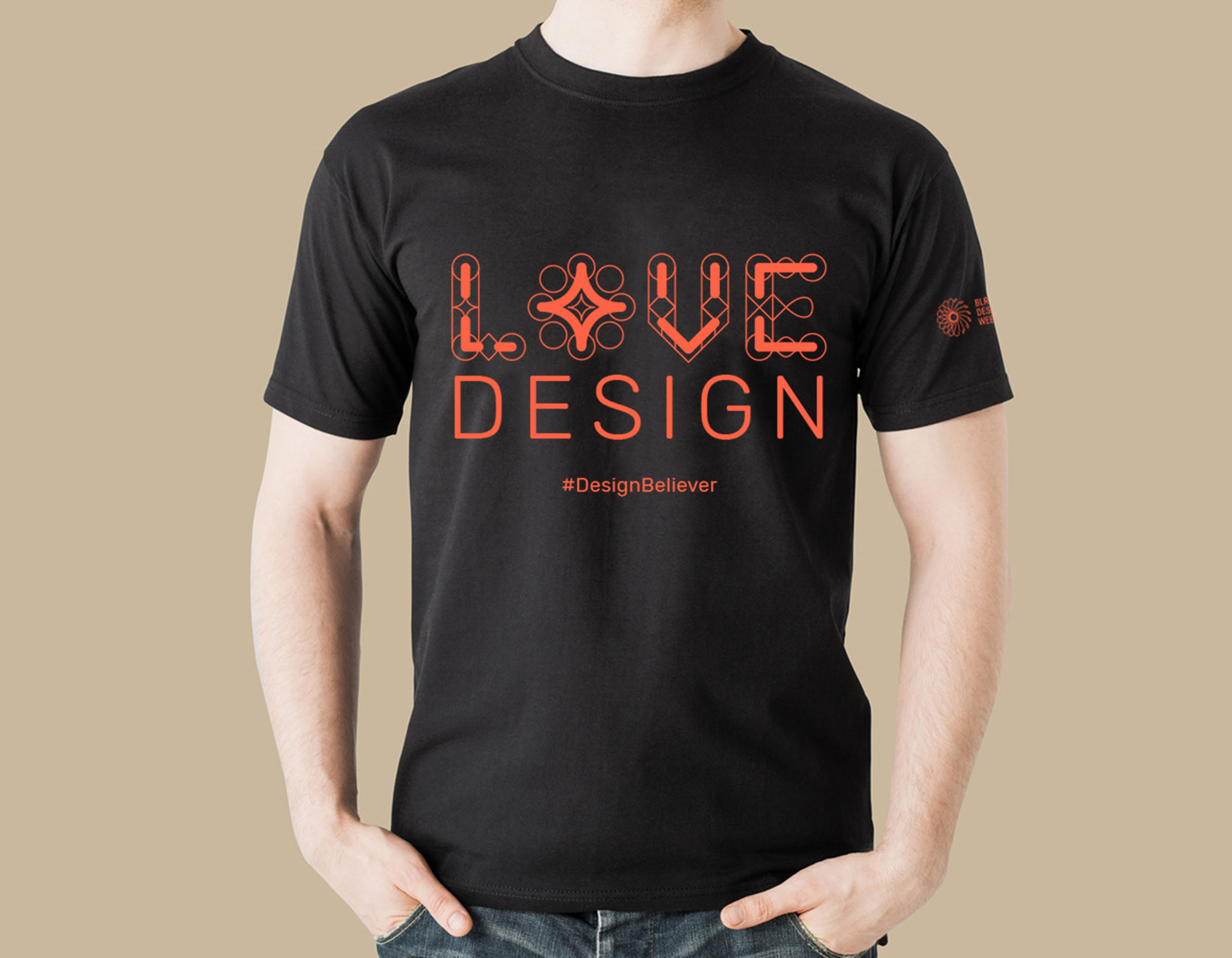
The identity is inspired by the city's much loved flowering trees – a burst of colours and energy. We abstracted this thought using the geometry of spirographs, to create the logo for Bengaluru Design Week.The logo is a half (left) geometric flower, and a half (right) organic flower. The geometric half represents the precision and process of design, business, tech and life. The organic half represents the fluidity and intuitive nature of design. A balance between the left brain and the right brain.
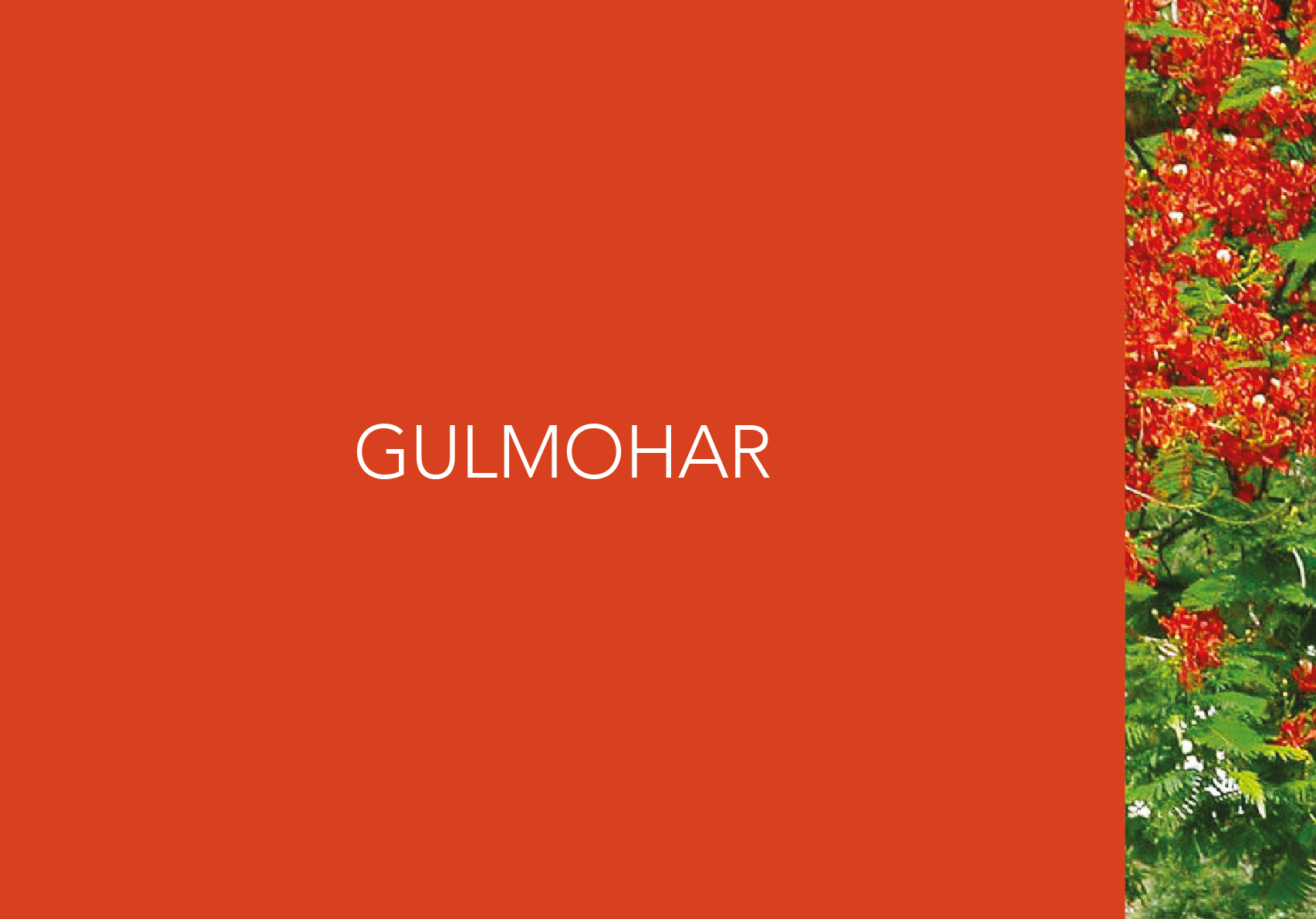

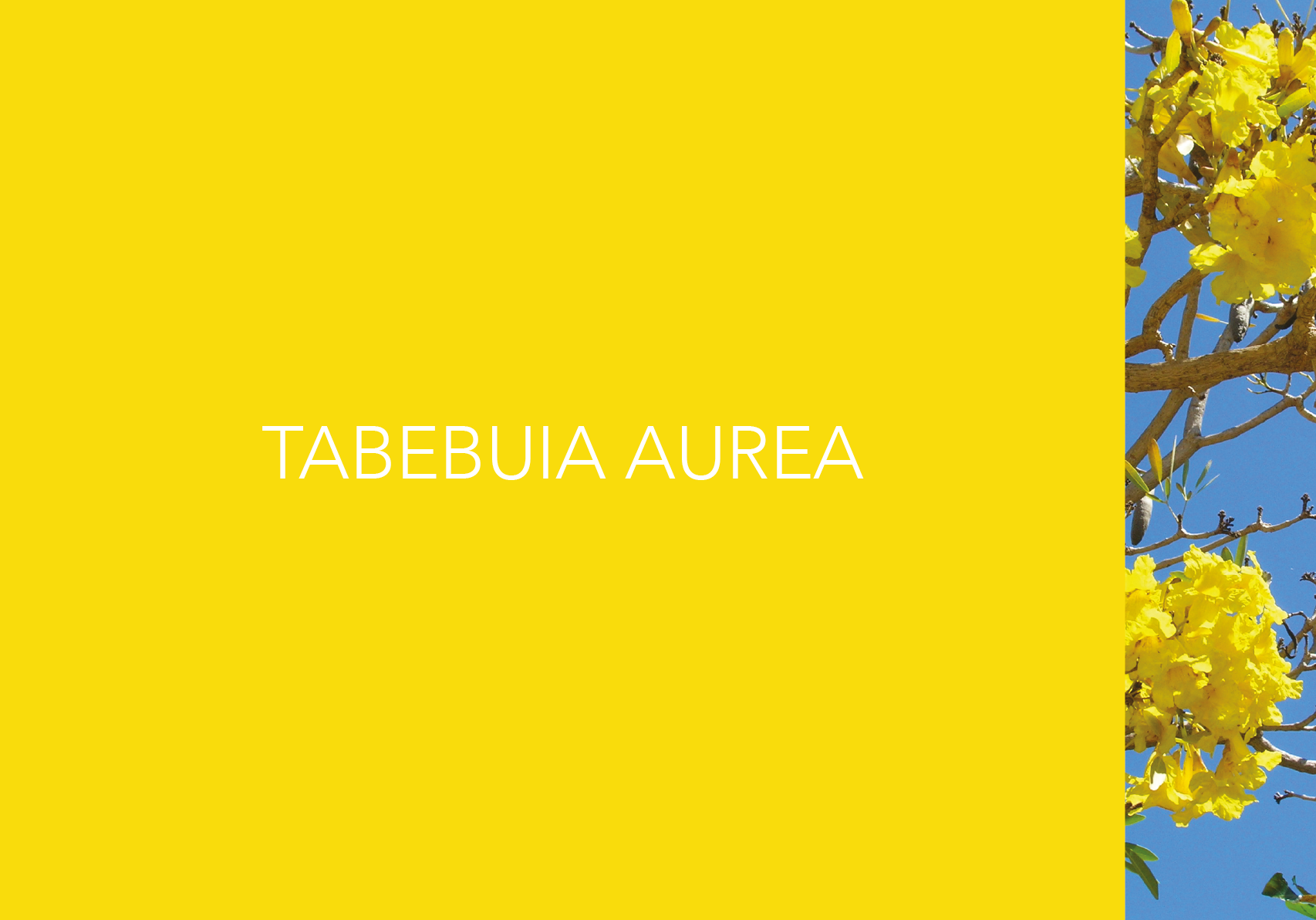
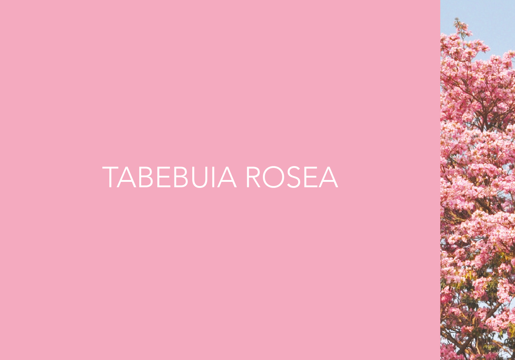
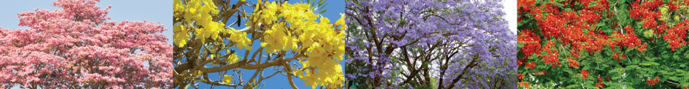
The much loved flowering trees of Bangalore
The colours were inspired by the four most prominent flowering trees of Bangalore. Their distinct oranges, purples, yellows and pinks formed a bold palette.


Team
Design Director
- Seema Seth
Design
- Shubhangi Goel
- Somesh Kumar
- Sukeshi Dalmia
- Gokul
- Tanvee Nabar
Client
- Association of Designers of India
Moral Support
- Manu Neelakandhan
- Rohit Chopra
- Ashish Goel