
Healthi
Everyday conversations about health
Healthi is a flexible healthcare benefits platform, that provides corporate employees with the best-in-class health and wellness benefits.
The brand was perceived differently by its stakeholders. We needed to create a consistent, strong and memorable brand positioning for Healthi.
It's a tree! It's a wall! It's a snake! No, it's an elephant.
The brand was being perceived differently by its different stakeholders. We were asked to define a brand position that was consistent and differentiated.We examined the brand from the point of view of its various stakeholders, and identify and articulate a core that stays true to its origin and has the ability to create meaning for all its users.We did a series of in-depth interviews with 30 people, along with a deep dive into the category and competition.
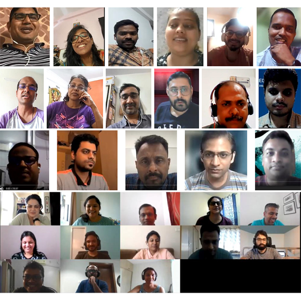
Compass: Brand Workshop
We conducted a workshop where the core team co-created a new direction for brand Healthi. Over two days, we engaged in deep discussions, group exercises, a Lego 'Serious Play' strategy session, and some fun banter. By the end of this workshop, we collectively arrived at a way forward.

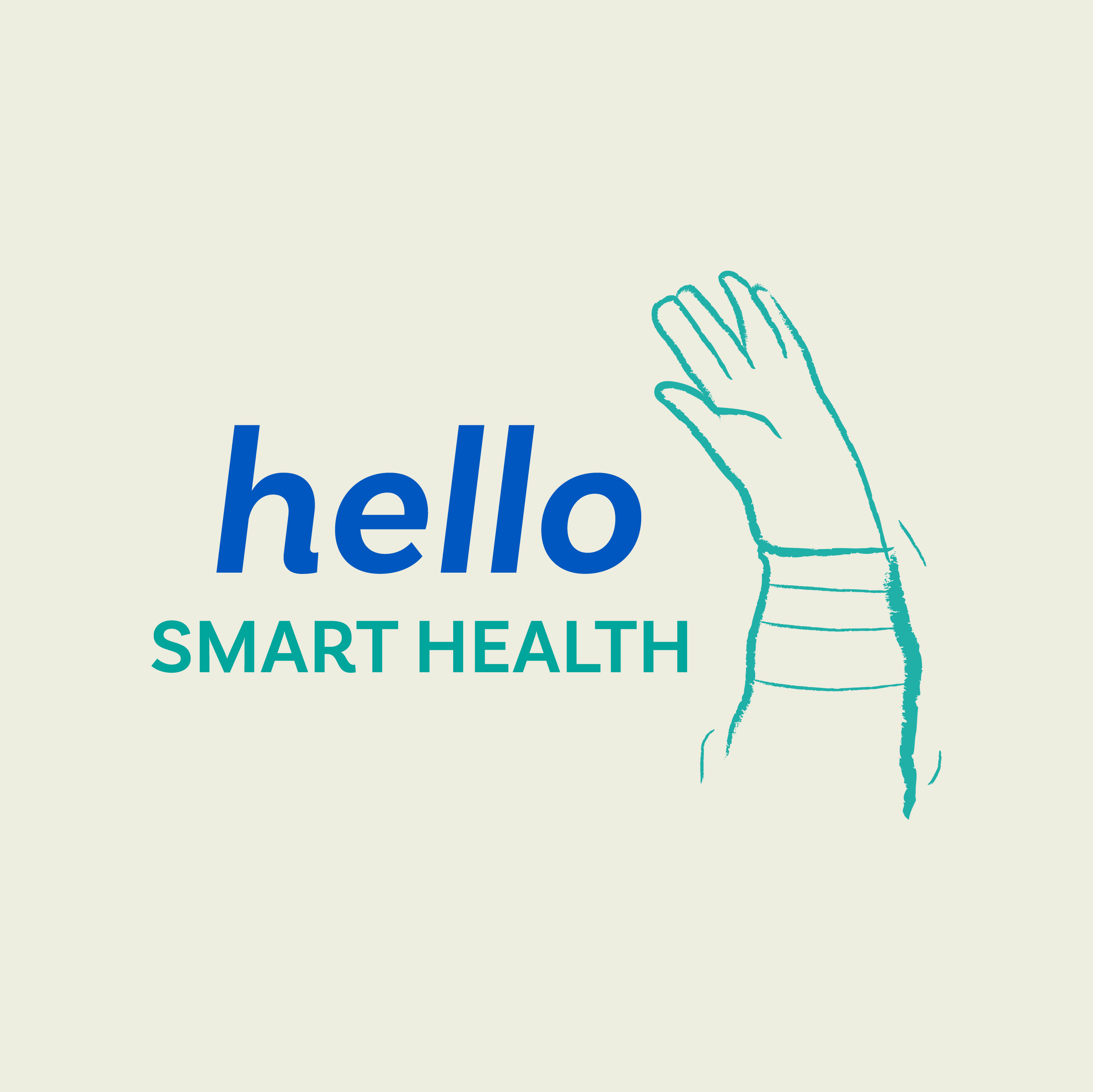
Something old. Something new.
A deeper understanding of the brand and the team led us to the decision to make minor tweaks to the existing identity, rather than attempting a complete redesign.We evaluated the choice of typeface, legibility, scalability and colour palette, before we sat down at the drawing board to envision the new version of the logo. We worked with a humanist typeface that mimics the way we write by hand. Approachable. Simple. Human.
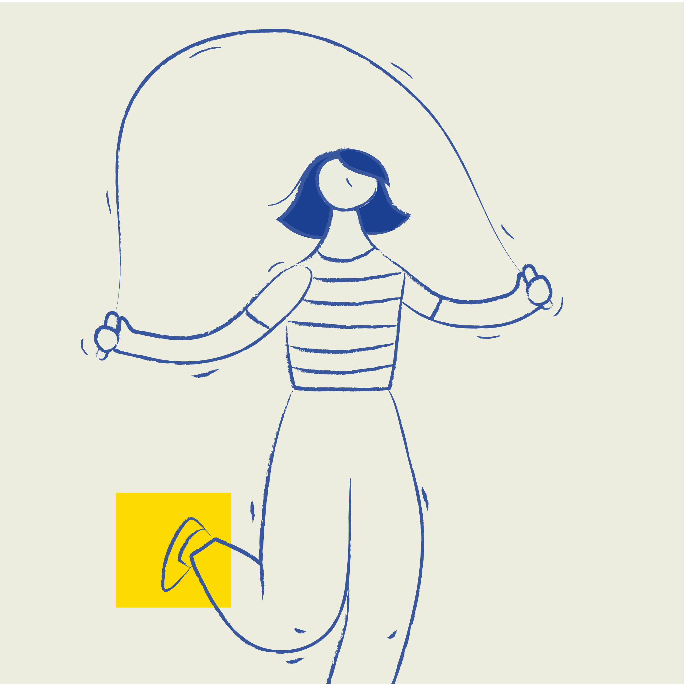
Creating everyday-ness
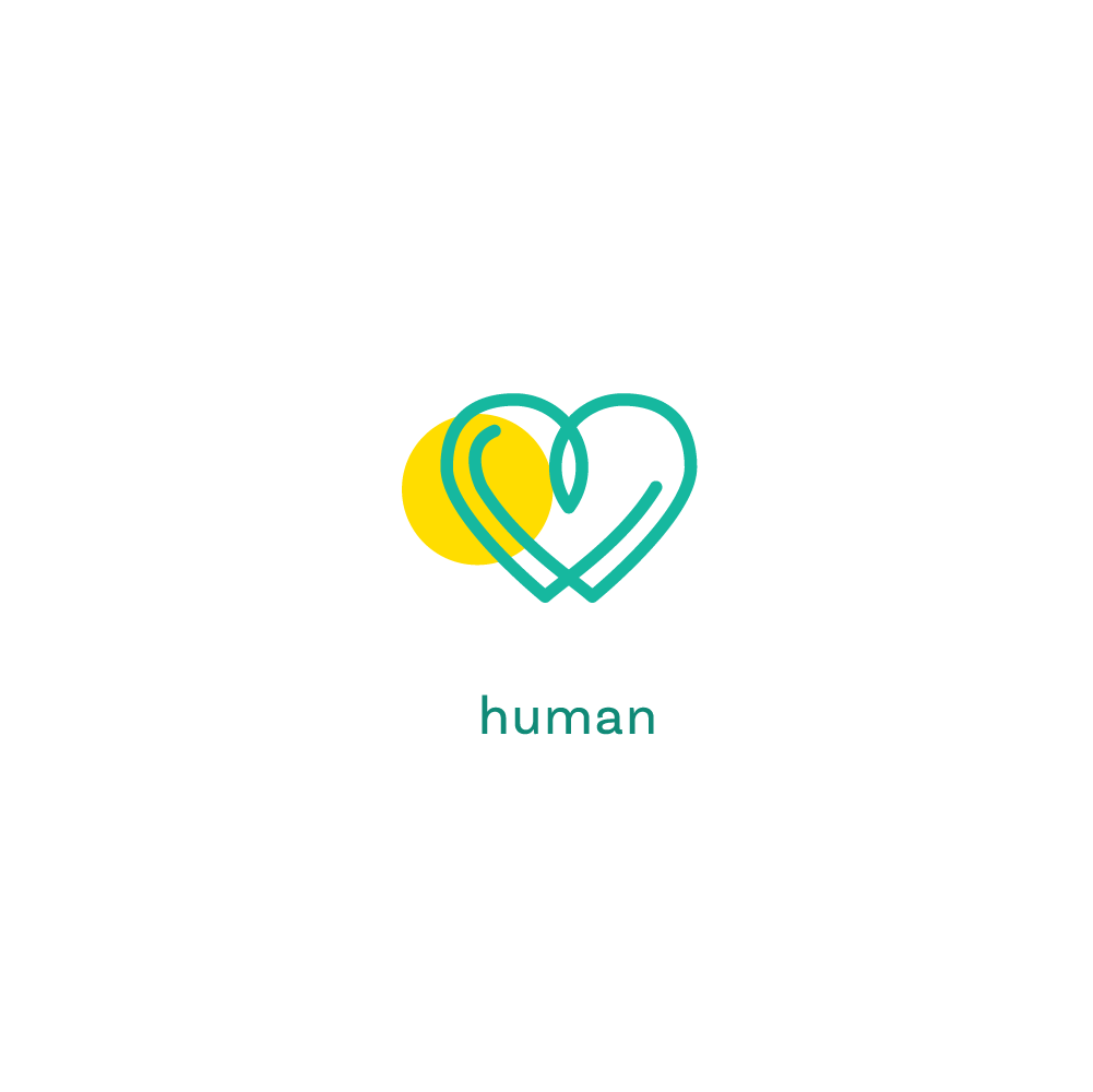
The visual and verbal language of the brand was rooted in simple everyday-ness. Hand-drawn doodles of relatable human forms guide you through the user journey. Simple, easy-to-understand, conversations around health make the brand approachable and accessible.


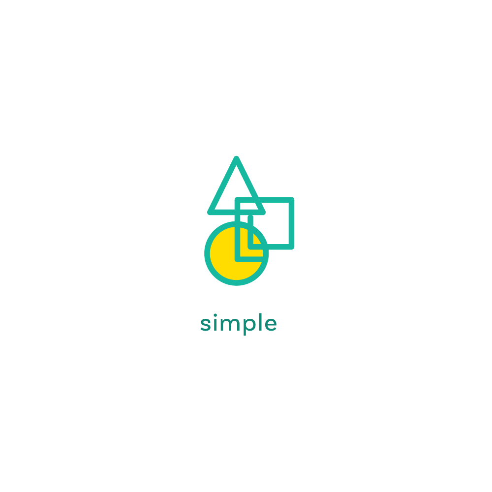

Everyday objects and metaphors
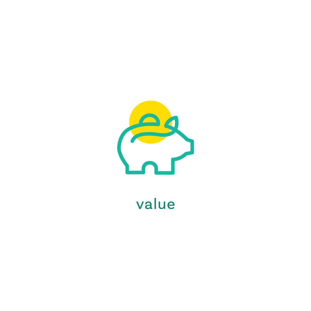
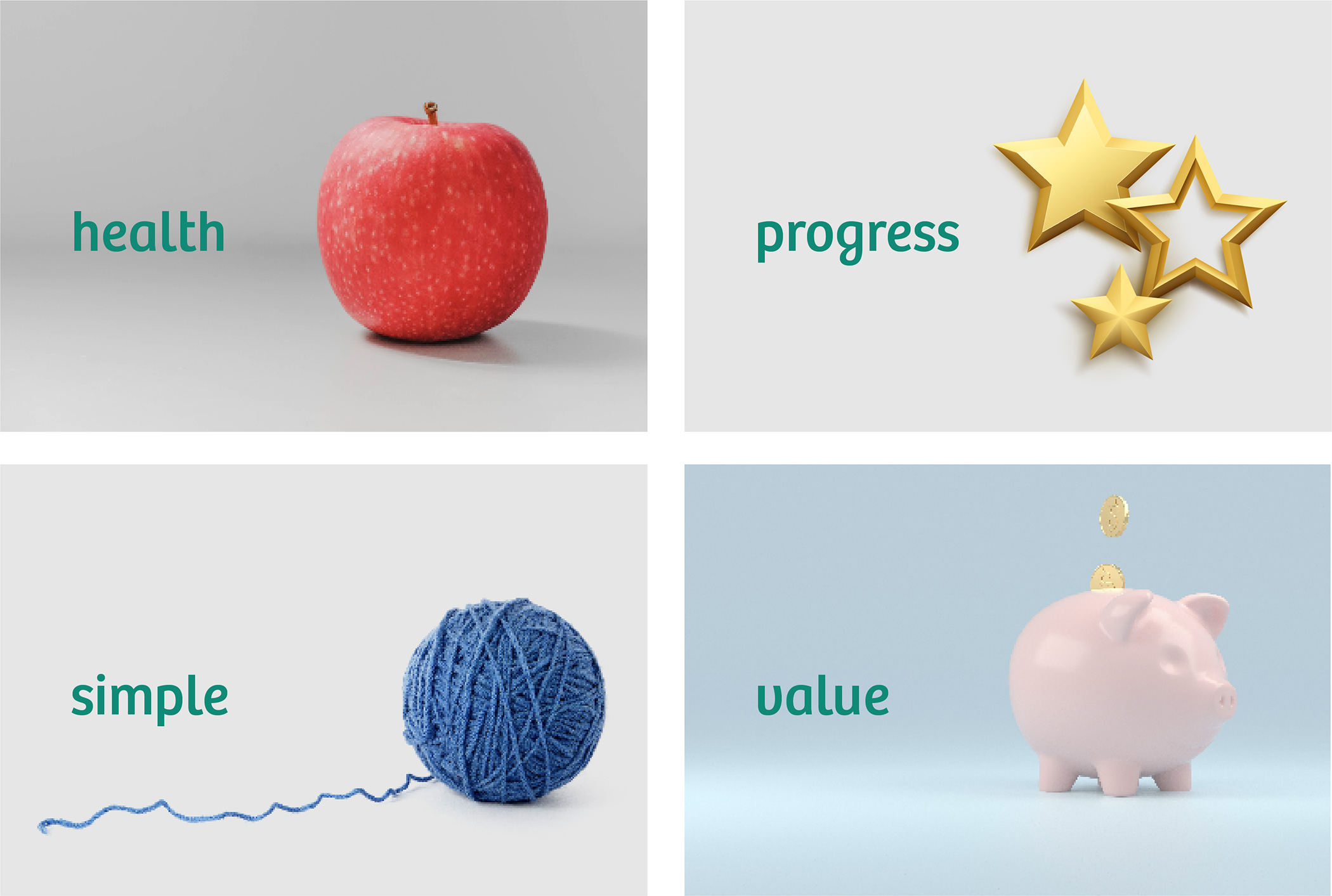
Relatable everyday objects, metaphors, analogies. The object is always the central focus. These visual metaphors convey simple and relatable messages.
Merging the physical and digital
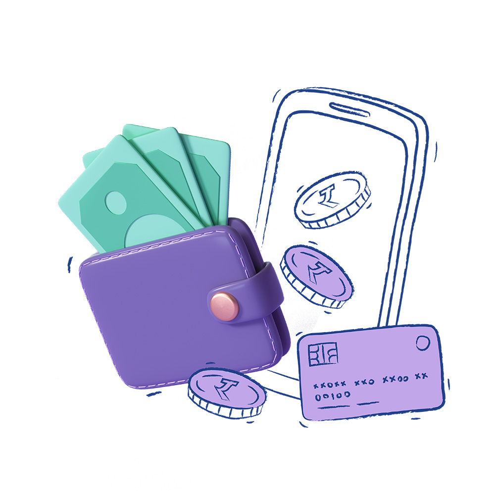
A combination of 2D and 3D objects allow us to traverse between the online and offline aspects of the brand.
A Lesson Learnt
This project went through its fair share of ups and downs. Shifts within the organisation’s vision and founding team, had a direct impact on our work. At the end of the day, most of the work we created for the brand wasn’t implemented. While this was tough to accept, it also taught us a lesson in letting go.
Team
Brand Strategy
- Runjhun Pacholi Bharadwaj
- Disha Upreti
Design
- Seema Seth
Illustrations
- Trusha Sawant
Client Team
- Rekuram Varadharaj
- Krishna Ulagaratchagan
- Vidhu Panicker